
472
So far, in this trading academy, we have covered some of the Japanese technical analysis concepts. The concept of a Japanese candlestick, the candlestick chart, and basic Japanese candlestick patterns – all these are a must for the wannabe technical analysis trader.
However, they are just rookie concepts, things that every trader must know and that they learn at the start of their trading/investing career.
We integrate more Japanese concepts as we move forward and deeper into this academy. The Intermediate section of the academy addressed the hammer pattern – a reversal pattern that consists only of one single candlestick.
The Japanese technical analysis resembles the Western technical analysis because it has classic patterns and indicators. While the classic technical analysis patterns in Japan are well represented, only a few indicators from Japan have gained the Western world’s respect.
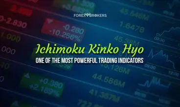
One of them is the Ichimoku Kinko Hyo indicator. Shortly after its introduction to the Western world, it grew in popularity so quickly that most trading platforms introduced it in the standard offering. Nowadays, no single trading platform does not have the Ichimoku Kinko Hyo indicator in its offering.
This article presents a full picture of the Ichimoku indicator, from the very basics to the most complex uses of it. We will discuss the indicator’s elements and their interpretation, but most importantly, we will focus on how to trade with it. Therefore, expect a lot of charts and trading setups, as well as videos explaining the concepts.
For the sake of diversity, the examples in the videos differ from those presented in the article. This allows the reader to observe and interpret different setups and see the power of the Ichimoku Kinko Hyo indicator.
Ichimoku Kinko Hyo – An Introduction
The Western world was stunned to discover that the Japanese used technical analysis concepts far earlier than the West. History shows that Japanese rice traders have used candlestick charts to analyze the evolution of rice prices since the eighteenth century.
Japanese candlestick charts and patterns reached the Western world in the early 1990s. It was an American that researched the Japanese financial history and introduced the world to new concepts such as the hammer pattern, the engulfing, the piercing, or the stars. Some years later, the Ichimoku also made its way into Western technical analysis.
The Ichimoku indicator is both a trend indicator and an oscillator. Moreover, it offers dynamic support and resistance, as well as horizontal. Furthermore, it shows past, present, and future levels that traders must consider.
When the trader applies the Ichimoku indicator on a chart, the first impression is overwhelming. This is because it has so many elements that the chart suddenly becomes crowded. Therefore, using the Ichimoku Kinko Hyo indicator together with other indicators is not wise.
One of the most important things to note about the Ichimoku indicator is that when trading with it, the trader must consider all its elements at once. All the lines on the chart have a meaning, and only by interpreting them together does the trader make the most of the information provided.
Here is the USDJPY daily chart with the Ichimoku indicator. The indicator’s elements, together, show the market’s equilibrium stance. If you are focusing on the current price, you will see that some elements of the indicator are right where the price is, but others are projected on the right and left sides.

For this reason, traders can become confused when interpreting the Ichimoku indicator on historical prices. However, things will become clearer after we cover all the elements and their roles.
Equilibrium at a Glance
The most relevant thing to consider when using Ichimoku is what it stands for – equilibrium. It shows the market in an equilibrium stance between the past, present, and future prices.
When setting up the indicator and applying it to the chart, the trader will notice that some of the indicator’s elements are shifted into the past and into the future. As such, at any one moment in time, the indicator shows support or resistance for present and future prices, also based on historical price action.
The chart below is the same as the previous one – the USDJPY daily timeframe. However, the three black lines are meant to show what the Ichimoku Kinko Hyo stands for. Namely – equilibrium at a glance, according to a rough translation.

The line in the middle corresponds to the current market price. Naturally, the other two lines show past and future levels – the one on the left refers to past prices and the one on the right at future prices.
For traders, it is extremely important to remember these three lines. Any given candlestick on a chart has equivalent levels in the past and in the future. The equilibrium refers to the actual market price. Basically, at any moment, it represents a market in equilibrium.
The extreme lines are shifted 26 periods on the left and right sides of the chart. Traders may edit the number of periods any way they want, but the original setup requires 26 periods.
As this article will explain, both past and future levels play a key role in trading the actual market. Moreover, they offer an educated guess as to where the market may find support or resistance in the future, as well as the nature of the market – trending or ranging.
Ichimoku Elements
Trading with the Ichimoku indicator means understanding each element’s role in the overall picture. All elements are part of the indicator’s interpretation, and only treated together can they offer the best information for taking a trade.
The indicator has five elements:
- The cloud, or kumo, as it is also called:
- Senkou A
- Senkou B
- The Kinjun line.
- The Tenkan line.
- The Chinkou line.
As you can see above, the kumo has two lines – Senkou A and Senkou B. The area between the two Senkou lines makes up the kumo, so the total number of elements is five (Senkou A and B, Kinjun, Tenkan, and Chinkou).
The chart below shows all elements and their position on the chart. Numbers 1 and 2 represent Senkou A and Senkou B, respectively. As mentioned earlier, the area between the two is the cloud or the kumo and it has two colors – green or red. In this example, the kumo is red, showing bearish conditions.

The blue line marked with the number 3 is the Kinjun and number 4 represents the Tenkan line (i.e., the red line). Finally, the Chinkou, number 5 on the chart above, completes the indicator.
It is very easy to understand the equilibrium property offered by the Ichimoku indicator at this point. In terms of its elements, the equilibrium is given by the fact that the kumo and Chinkou are always shifted 26 periods ahead and behind the current price. As for the Tenkan and Kinjun lines, they always refer to the current price.
Note here that the indicator projects the levels on the right side of the chart. This is tricky because the trader gets confused about what level belongs to what element and where the market price is. However, this option can be deactivated from the settings, and on some platforms, like the MetaTrader, only the market price appears.
Kumo – The Cloud
The Ichimoku cloud, or the кumo, is the most visible part of the indicator. It only has two colors – green or red, showing bullish or bearish conditions, respectively.
The most important thing to know about the Ichimoku cloud is that the indicator projects it 26 periods into the future. So, for example, if you look at the Ichimoku cloud on the daily chart, the cloud does not end with the current market price but continues on the right side of the chart for another 26 periods (in this case, days).
It has multiple interpretations. One is that it offers resistance or support to the current market price. Therefore, when the cloud is bearish or red, like in the chart below, it offers resistance when the market tries to get through it.
At any one point, the Ichimoku cloud may be below, above, or at the current market price. Because the indicator projects the cloud into the future, it tells the trader the potential future levels of support or resistance.

Let’s focus on the chart above. Forget for a minute about the current market price. Instead, look further on the right side of the chart. You will notice that the cloud turns green. It means that a bullish sign has just formed and will confirm the bullish conditions.
Therefore, if, for example, the trader interprets the current price action on the daily USDJPY chart as a pennant formation or a bullish continuation pattern, it helps to know that the cloud, 26 periods from now, just turned bullish. This is just one of the interpretations of the Ichimoku cloud, but many others exist, as you will find out later in this article.
Senkou A and Senkou B
The Senkou A and B lines are the kumo’s edges or extremes. In a bullish cloud formation (i.e., a green one), Senkou A sits above Senkou B. Conversely, in a bearish cloud formation, Senkou A sits below Senkou B, just like in the chart below.
The bigger the distance between the two Senkou lines, the fatter the cloud is. This does not mean that the market is extremely bearish or bullish – it only shows that the two lines, which are nothing but some special moving averages, are distorted by the current price action.
When trading with the indicator, these lines are often referred to as the “upper edge of the cloud” or the “lower edge of the cloud.” However, at any one point, both lines may be the “upper edge of the cloud.” In a bearish cloud, as shown below, Senkou B is the “upper edge of the cloud.” However, if the cloud had been bullish, then the “upper edge of the cloud” would be Senkou A.

All that matters when looking at the two Senkou lines is their role in the projected cloud. More precisely, their intersection.
When the two lines cross, the cloud or kumo changes color. With that, it shows changing market conditions – from bullish to bearish or from bearish to bullish. Because of that, traders keep their eye 26 periods ahead of the current market price to spot the two Senkou lines’ crossing.
Another way to use the Senkou lines is to look for support and resistance at the edges of the cloud. As mentioned earlier, these edges are either Senkou A or Senkou B, and they offer both horizontal and dynamic support or resistance. Dynamic support or resistance levels (i.e., that do not form on the horizontal) are more powerful between the two.
Kinjun and Tenkan
The Kinjun (blue) and Tenkan (orange) lines seen in the chart below act as regular moving averages. They are not calculated like a regular Simple Moving Average (SMA) or Exponential Moving Average (EMA), but their calculation methodology comes close.

Therefore, their use and interpretation are similar when traders focus only on the information provided by their levels. It is like you trade with two moving averages on a chart – one faster, the Tenkan line, and one slower, the Kinjun line.
One of the advantages of the Ichimoku indicator is that traders may use its elements together or separately. For example, one can trade with the cloud by only selling against resistance or buying against support. Or, one can trade only based on the information provided by the Kinjun and Tenkan lines.
Traders keep a close eye on the two lines. In strong trends, the two lines do not intersect. More precisely, in strong bullish trends, the Tenkan line (the fastest) will always be below the Kinjun line. Conversely, the Tenkan line will always be above the Kinjun line in a strong bearish trend.
Just like regular moving averages, they offer support or resistance every time the market tests the lines. One thing to note on the two lines – the information provided refers to the current market price, just as the information provided by a moving average does.
The Kinjun/Tenkan cross is the most simplistic way to use the Ichimoku indicator. When the two lines cross, they signal a change in trend. Some traders use the signal in conjunction with the color of the projected cloud. More precisely, the traders feel more confident in taking the trade on a bullish Kinjun/Tenkan cross and a cloud that turns green 26 periods from the current market price.
Chinkou
The Chinkou is, perhaps, the most important element of the Ichimoku indicator. Yet, despite this, many traders choose to ignore it for the simple reason that they do not understand the role of the Chinkou line with the indicator.
Truth be told, this is a confusing element, and it has some particularities that must be known in advance. First, consider it as the current market price, which shifted backwards 26 periods. In other words, the Chinkou line represents the current market price. One good question here is – why do we need the current market price shifted backwards 26 periods? The answer comes from the way to use this line – as it has the tendency to react from previous elements that the Ichimoku indicator plotted on the screen. Also, it tends to avoid the candlesticks in front of it.

Second, the Chinkou line does not show the upper and lower shadows seen on the candlestick chart. Instead, the line reveals only each period's closing and opening levels. For example, the USDJPY pair traveled above the 104 level on the current daily candlestick. As seen on the chart above, the candlestick shows the upper shadow, illustrating that the price was at one point. However, if we look at the Chinkou line 26 periods earlier, the move corresponding to the upper shadow does not appear in the Chinkou’s evolution.
These are the two characteristics to consider when interpreting the Chinkou – it does not show the shadows and is the current market price projected backward in 26 periods. Any trader who fully understands Chinkou’s role in the overall “equilibrium at a glance” balance will have a competitive advantage in front of the market.
Past, Present and Future
The chart below shows the same currency pair, but this time on a bigger timeframe – the weekly. It better illustrates the past-present-future as seen through the Ichimoku lens.

Let’s start with the present. The chart shows the present via the current market price. On the same level, the Chinkou line appears on the chart, but 26 periods (weeks) earlier. The cloud is projected 26 periods into the future at the opposite end of the spectrum.
The big difference between the cloud and Chinkou’s projection is that, in the case of the cloud, it changes its shape and levels with each projected period. However, the Chinkou does not. Effectively, it means that the levels between the current market price until the cloud and between the current market price and the Chinkou will offer strong support or resistance levels into the future.
This is a key concept to understand when trading with the Ichimoku Kinko Hyo indicator. Now that we have defined the Ichimoku elements and their role let’s look at some examples. More precisely, the second part of this article will show trading strategies with the Ichimoku so that the trader fully understands how to use it.
Check out our video about the Ichimoku Kinko Hyo:
Ichimoku Kinko Hyo Explained – Тhe Ultimate Trading Tool – ForexBrokers.net
Intermediate
Ichimoku Kinko Hyo Explained – Тhe Ultimate Trading Tool – ForexBrokers.net
Trading with the Ichimoku Kinko Hyo Indicator
The following section of this article covers different trading strategies with the Ichimoku Kinko Hyo. Before starting, consider that all these strategies are based solely on the information the Ichimoku Kinko Hyo provided. Some traders use it in conjunction with other indicators or with other analyses they have previously made (e.g., Elliott Waves Theory).
If we are to group the strategies into three big categories, these are:
- Trading with the cloud.
- Trading the Kinjun/Tenkan cross.
- Trading with the Ichimoku.
One can use any strategy individually, but the best way to make the most of the Ichimoku indicator is to combine their information to reinforce a trade.
Using the Cloud as Support or Resistance
The first way of using the Ichimoku Kinko Hyo is to interpret the current market price action in relation to the cloud. Remember that the cloud is projected 26 periods ahead of the current price. Therefore, the cloud area on the chart that appears above or below the current market price appeared on the chart 26 periods earlier.
This strategy involves using the trending component of the Ichimoku Kinko Hyo indicator. Under perfect trending conditions with the Ichimoku, the following setup must be in place in a bearish market:
- Tenkan is below Kinjun and trending lower.
- The cloud or kumo is bearish (i.e., red).
- The Chinkou line must be below all other Ichimoku elements, including the candlesticks that appear on the chart.
Naturally, a bullish market needs the opposite to be in place:
- The Tenkan line is above the Kinjun one.
- The cloud is bullish (i.e., green).
- The Chinkou line must be above all other Ichimoku elements, including the candlesticks that appear on the chart.
Trading with the Cloud
Once again – for this strategy, the market must be in perfect trending conditions as reflected by the Ichimoku cloud. The idea is that by the time the market tries to reverse the first time it hits the cloud, the cloud will act as support or resistance. Hence, traders should sell after a bullish reversal or buy after a bearish reversal.
The best way to illustrate this is by using the power of an example. The same USDJPY daily chart reveals a market previously in a bearish trend. However, as the chart below shows, the price reversed and closed above the Kinjun line at one point. This is the first sign of a potential market reversal. Why Kinjun and not Tenkan? Because Kinjun is the slowest average, a close above Kinjun is more valuable from a reversal’s perspective.

Once the market broke (and closed) above the Kinjun line, as indicated by the circle on the chart above, the focus shifts to the cloud. It must be bearish red, and traders want to sell the first time the price hits the cloud.
The three arrows show possible places to go short from left to right. Every time, the stop-loss should be placed at the opposite edge of the cloud (i.e., Senkou B line).
In the first case, the market did not quite touch the cloud. Anyway, aggressive traders may push their luck on such a move, especially considering that the risk was extremely small (i.e., short distance to the stop).
The second arrow actually illustrates the first time the price touched the cloud. The moment this happens, traders go short with a stop at the upper edge of the cloud. While the market does retrace, two days later, it comes back and touches the cloud again.
The principle of dynamic support and resistance tells us that the more the price comes to dynamic or resistance levels, the bigger the chance that it will overcome the level. For this reason, only the first touch of the cloud should be used.
As for the take-profit levels to be applied, two options exist. One is the classic risk-reward ratio of 1:2. In other words since we know the stop-loss or the risk level, we can project the take-profit as twice the risk. However, if the market manages to touch the cloud again, we should close the trade as it shows strength.
Trading the Kinjun/Tenkan Cross
The next strategy deals with the cross between the two average parts of the Ichimoku indicator – the Kinjun and Tenkan lines. As mentioned earlier, they act as classic moving averages, following the same principles – when the fastest moving average crosses above or below the slowest one, the market changes direction. More precisely, this is the first thing to note when a trend changes from bullish to bearish or from bearish to bullish.
When trading with moving averages, the so-called golden and death crosses are similar to the Kinjun and Tenkan cross. In a golden cross formation, the fastest SMA (Simple Moving Average) moves above the slowest one, triggering a buy signal. In a death cross formation, the fastest SMA crosses below the slowest one, triggering a sell signal.
The Kinjun and Tenkan lines function in a similar fashion. Therefore, one way is to trade them like that – to go long when Tenkan moves above the Kinjun and short when it moves below. However, that would give plenty of false breakouts, and while it works on average, it lacks consistency. As such, a better approach is integrating the Kinjun and Tenkan cross with another element of the Ichimoku indicator – the cloud.
Using the Cloud for Cross Confirmation
One way to filter the potentially false breakout given by the crossing of the Kinjun and Tenkan lines is to use the color of the cloud. Remember that the projected cloud that belongs to the current market price was actually projected 26 periods earlier. Therefore, if the conditions were the same 26 periods before the Kinjun and Tenkan lines crossed, it means that the chances are that the new cross if it happens in the same direction, shows the main trend resuming.
Have a look at the chart below. It shows the weekly USDJPY timeframe presented earlier. There are three Kinjun and Tenkan line crosses from left to right, marked with three individual circles.

On the first cross, the Tenkan moves above the Kinjun line. It shows a bullish cross, but savvy traders also look at the cloud for confirmation. If the cloud is green, thus showing bullish conditions, it means that it confirms or reinforces the bullish signal. On this particular trade, by going long the USDJPY on the cloud’s confirming the bullish cross, traders enjoyed a ride of a couple of hundred pips or more.
The second cross, represented by the second circle, shows the Tenkan line moving above Kinjun – a bullish signal again. Only this time, the cloud is bearish, and thus the signal should be ignored.
Finally, the third cross shows the Tenkan moving back below the Kinjun in a clear, bearish setup. Given that the cloud is still red or bearish, it reinforces the sell signal. From that moment, the USDJPY bearish trend continues. To trade it, one may choose to trail the stop with the market moving to protect the profits.
How to Use Chinkou When Trading Current Market Levels
The last strategy presented in this article involves the interpretation of Chinkou in relation to the current market price. Keep in mind that the Chinkou line, while derived from the current market price, is projected 26 periods ahead of the price.
The Chinkou is designed in such a way as to try to avoid all the “obstacles” in front of it. Therefore, in a bearish trend, the Chinkou is below:
- Tenkan
- Kinjun
- Price
- Senkou A – lower edge of the cloud
- Senkou B – higher edge of the cloud
All these elements represent dynamic resistance levels for the Chinkou. Therefore, the current market price should react when the Chinkou comes closer to any of these levels. Naturally, the bigger the timeframe, the stronger the support or resistance in front of the Chinkou.
The opposite is valid when the market is in a bullish trend. When that happens, the Chinkou is above:
- Tenkan
- Kinjun
- Price
- Senkou A – upper edge of the cloud
- Senkou B – lower edge of the cloud
Therefore, all these elements represent dynamic support for the Chinkou, and its first reaction should be to try to avoid them. The closer it comes to any of the elements mentioned above, the weaker the trend becomes.
Dynamic Support and Resistance Levels for Chinkou – Five Levels to Understand
Again, we use an example to illustrate how to interpret the support and resistance levels in front of the Chinkou. The chart below shows the USDJPY trading at 103.88 and, 16 periods earlier, the Chinkou line showing the same level. The market, as can be seen, is in a bearish trend.

Everything above represents an obstacle for Chinkou (as marked on the chart by the first circle from the right). Because Chinkou’s price level equals the current market price, the current market price might be rejected when Chinkou comes closer to these elements. If you want, everything above Chinkou represents historical resistance that might affect the current price. Now, it becomes clear why the Ichimoku cloud refers to the past, present, and future and how all the elements come together in a forecast.
Let’s move our attention to the left side of the chart now, right where the black square is. It shows the Chinkou hitting the cloud. Remember two key things here – when the indicator plotted the cloud, the price was 26 periods on the left side, and the Chinkou was 52 periods on the left side. As such, when the Chinkou hits the cloud, the cloud should offer massive resistance, especially considering that this is a big timeframe – weekly.
From the moment the Chinkou hits the cloud, the price (where the second down arrow appears) was strongly rejected, falling almost a thousand pips in a clear bearish trend. Can you identify the level of Chinkou that corresponds to the first arrow from the left?
Deciphering Ichimoku Kinko Hyo – Essential Strategies for Forex Traders – ForexBrokers.net
Intermediate
Deciphering Ichimoku Kinko Hyo – Essential Strategies for Forex Traders – ForexBrokers.net
Conclusion
The Ichimoku Kinko Hyo indicator belongs to the Japanese technical analysis. It is an indicator like no other that successfully blends the past, present, and future levels to deliver an accurate forecast.
Traders find integrating all the Ichimoku elements in one trading decision challenging. However, only when used together, do they act the way the indicator was built in the first place.
Out of all the Ichimoku elements, the Chinkou is the most important one. At the same time, it is an element often misunderstood by traders. This is because traders choose to focus on the most visible elements, like the cloud, for instance. Also, many traders find the Chinkou line useless, arguing that it shows historical prices with no impact on the current market price. However, as this article proved, the reality begs to differ.
The Japanese technical analysis is home to many interesting concepts. For example, the Japanese have a different way of interpreting gaps, as explained in a different part of this academy. Or, the reversal patterns presented in the Japanese technical analysis use different concepts than those in classic technical analysis.
In contrast to most Japanese technical concepts, the Ichimoku indicator is more complex than most of the indicators belonging to the Western technical analysis. For this reason, traders often avoid it by choosing classic moving averages or oscillators to trade the market.
Related Lessons


See more from this category