

302
Technical analysis comprises trading strategies based on interpreting historical price data. Market participants use either technical indicators or trading theories to forecast future price levels based on historical ones.
Few believe technical analysis truly works, but the performance of technical strategies over the years says otherwise. According to the efficient market theory, technical analysis belongs to the weakest level, believed to lead to superior returns when trading emerging markets. In many ways, technical traders look for arbitrage opportunities or for opportunities that were not arbitraged away by other market participants.
One important thing to consider in technical trading is the originality of a trading strategy or system. The rise of computers has led to the appearance of software that scans the charts in search of various patterns. Moreover, the software is programmed to act on its findings, effectively buying or selling an asset.
This is why classic technical analysis patterns fail more often today than in the past – they are discovered quickly and when something is obvious in trading, it usually fails. For this reason, originality is a key ingredient to successful trading.
Besides technical indicators, technical trading theories exist. A trading theory is based on a set of rules and principles applied to historical prices in order to forecast future ones. The Elliott Waves Theory presented in various articles part of this trading academy is the perfect example of a trading theory. Others exist, too, such as the Gartley method of trading, Gann, Pitchfork, point and figure, and the Drummond theory.
This article presents one of the most mysterious trading strategies – the Drummond theory. Named after a Canadian trader, the theory is mysterious because there are no indicators offered by trading platforms. Also, the rules used to forecast future prices are not so simple.
Drummond Geometry Explained
Over time, the principles explained by Charles Drummond have become known as Drummond Geometry. The name comes from the concept of market geometry – one of the oldest concepts in technical analysis.
Market geometry uses both dynamic and horizontal support and resistance levels based on historical prices and projects them on the right side of the chart. The idea is that the levels found based on price data from the past will offer support or resistance in the future.
Drummond geometry has several assumptions that the trader must be aware of. However, don’t be scared because these assumptions are nothing new to the technical trader. Remember that the technical trader assumes that the market is inefficient and uses technical analysis, mostly based on patterns, to speculate on these inefficiencies.
In explaining Drummond Geometry in simple terms, this article will start by presenting the theory's origins first, and introducing Charles Drummond. We will then continue with the assumptions of the Drummond theory, followed by how to find resistance and support levels using the PL dot concept.
As you are about to find out, the PL dot is a concept unique to Drummond Geometry. It is an average of an average and is responsible for finding the support and resistance levels. This article will explain the PL dot formula, and perhaps our readers with programming knowledge may build an indicator that plots the values automatically.
Finally, we will look at some trending techniques and how to find buying and selling signals using Drummond Geometry. Very importantly, at each step, we will use examples from the actual currency market to explain the concept to everybody’s understanding.
Charles Drummond and the Origins of the Drummond Theory
Drummond is a Canadian trader and an active contributor to the field of technical analysis. Born in 1936, the Toronto-raised Drummond became famous for trading theories like the Point and Line and Drummond Geometry.
The subject of this article, the Drummond Geometry trading system, focuses on constantly projecting evolving support and resistance based on historical price data. Indeed, Drummond Geometry makes use of classic technical analysis tools, such as trend lines and moving averages, but it does so in an innovative way.
The best approach to trading the foreign exchange market using Drummond Geometry is to use a top/down analysis perspective. In this way, Drummond’s Geometry resembles the Elliott Waves Theory.
Just like in the Elliott Waves Theory, a top/down analysis starts with the analysis of bigger timeframes before moving to lower ones. As such, traders start with the monthly chart to get the bigger picture and then move down to the weekly, daily, and 4h timeframes to take advantage of all the opportunities.
Unlike other trading theories, the Drummond Geometry theory is built for the forex market. Charles Drummond pointed out that the foreign exchange market, with its geopolitics forces that shape the market movements, is perfect for the theory. This is not the case with other well-known theories, such as the Elliott Waves, Gartley, Gann, and Pitchfork – all of them built for the stock market and adapted afterward by traders that used them on the currency market.
Drummond Theory’s Assumptions
Like any trading theory or technical analysis concept, Drummond Geometry is built on a set of assumptions. Once again, a comparison with the Elliott Waves Theory makes sense.
The Elliott Waves Theory is built on the assumption that the market moves in waves. As such, a cycle with the Elliott Waves Theory comprises a 5-wave structure, followed by a 3-wave correction. Therefore, in a bullish run, the market adances with an impulsive wave, or the 5-wave structure, and corrects with the 3-wave structure. Also, there are various cycles of different degrees, so the top/down analysis approach is the best way to count the Elliott Waves.
Assumptions, therefore, are the building block of every solid technical analysis theory. In the case of the Drummond theory, the pillar of the theory is the fact that support and resistance can be measured, projected and, thus, predicted. Moreover, the theory is based on the idea that patterns exist on different timeframes with similar characteristics.
In other words, just like an ascending triangle, for example, it may form on the hourly and monthly charts. Finally, another assumption is that the price will react to support and resistance levels following a bottom/up approach. This means the shorter timeframes will react first and then the longer ones.
Resistance and Support Levels Using the PL Dot
The key to the Drummond theory is the PL dot. The PL stands for Point and Line, and the “dot” results from a mathematical formula that averages the average of the high, low, and close of the previous 3 bars.
We can use both candlesticks and bar charts as they show the needed data. It is worth mentioning here that the PL dot is the pillar of Drummond Geometry. Therefore, understanding the process is key.
To ensure we leave no stone unturned, we start by using the biggest timeframe on the EURUSD pair – the monthly chart. Here is the monthly timeframe for the EURUSD pair and our starting point in explaining the Drummond theory.
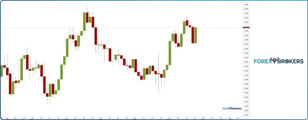
It shows the price action on the EURUSD pair in the last years, including the market’s reaction during the COVID-19 pandemic. We will use it to calculate the PL dot and then build examples of how to trade the currency market with the Drummond theory.
Before starting, it is helpful to note that the Drummond theory projects the PL dot on the right side of the chart. More precisely, it uses the data of the previous 3 candlesticks to plot the dot in the next period.
Therefore, the data of any given candlestick can only be used if the candlestick is closed. As such, the chart above shows the April 2021 EURUSD candlestick as the last candlestick on the chart, but there are still some trading days left in the month. Hence, if we use the PL dot formula, we must use the previous 3 candlesticks’ data – January, February, and March 2021.
PL Dot Formula
The PL dot formula averages the high, low, and close prices of the previous 3 candlesticks. The result, or the PL dot, is a point projected on the right side of the chart, where the next candlestick should appear, that shows significant support and resistance level.
As usual, when it comes to support and resistance, the bigger the timeframe, the stronger the level. Also, once support is broken, it turns into resistance and the other way around. Thus, the interchangeability principle is also valid when using the Drummond theory.
Here is the formula for the calculation of the PL dot for April 2021. We need the following data:
- High, low and close for January 2021.
- High, low and close for February 2021.
- High, low and close for March 2021.
PL dot = ((Average (High, Low, Close, January 2021) + (Average (High, Low, Close, February 2021) + (Average (High, Low, Close, March 2021))/3
In other words, this is an average of the average of high, low, and close data for each of the previous 3 months. Armed with this information, we can easily calculate the PL dot for April 2021 by filling in the data.
Calculating the PL Dot on the EURUSD Chart for April 2021
Armed with the formula, it is quite easy to calculate the PL dot for any given month, provided the month has ended. Here is the data used for calculating the PL dot for April 2021:
- January 2021:
- High: 1.23494
- Low: 1.20535
- Close: 1.21227
- February 2021:
- High: 1.22433
- Low: 1.19522
- Close: 1.20903
- March 2021:
- High: 1.21132
- Low: 1.17040
- Close: 1.17270
Next, we need to average the data for each month. By doing so, we obtain the following averages:
- January 2021: 1.21752
- February 2021: 1.20952
- March 2021: 1.18480
Finally, there is one more average to calculate, of the 3 values corresponding to each month. By doing so, we find out the PL dot for the following month (i.e., April 2021) by simply adding the 3 averages calculated above and dividing the result by 3. In other words, this is a simple arithmetic mean used as the final step in calculating the PL dot.
The result is 1.20394 – the PL dot for the month of April 2021 on the EURUSD pair. Remember that the Drummond theory uses a top/down approach. Therefore, this is an important level to consider on shorter timeframes as well, to find out levels where the market might find support or resistance.
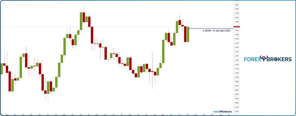
We see that in the 3 months to April, the EURUSD declined from the highs. Thus, the PL dot 1.20394 corresponding to April is a pivotal level, offering resistance on the way to the upside.
Using the Monthly PL Dot as a Pivotal Level on Shorter Timeframes
The PL dot or 1 single PL dot acts as a pivotal level. The calculation on the monthly chart of any single PL dot represents a pivotal level to use on the lower timeframes.
As such, after traders find out the PL dot for the next month, they draw a horizontal line corresponding to the dot and project it on the right side of the chart. The line should act as strong horizontal resistance or support for future price action.
The April 2021 hourly chart seen below shows the price action during the month. The month did not end at the time of writing this article, but it is clear how the PL dot acted at a pivotal level.
First, the EURUSD price action was extremely bullish all month. The market rose from the 1.17 area all the way to above 1.21, in a rally exceeding 4 big figures (i.e., four hundred pips).
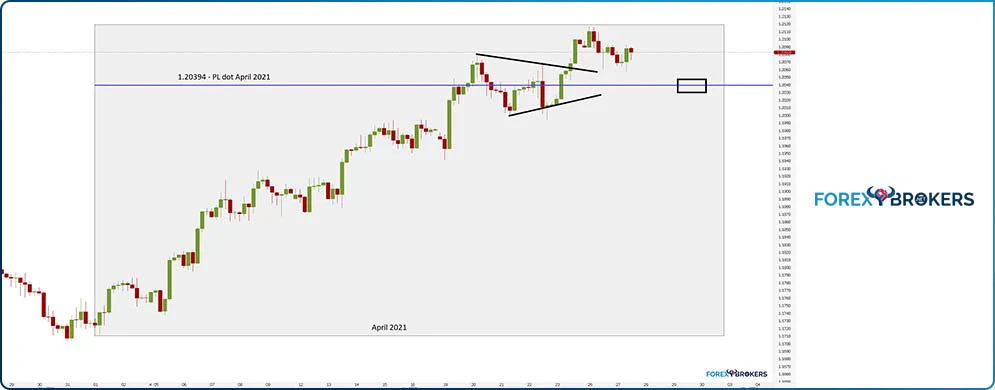
It literally met no resistance all the way to the monthly PL dot, where it hesitated for a while. The pair formed a triangle as a continuation pattern before breaking higher and reaching a new high for the month.
Moving forward, the PL dot is pivotal. On a quick move back to it, the market will form a head and shoulders pattern, with the consolidation on the right shoulder taking place around the April 2021 PL dot level. In any case, the market should find support on the PL dot level now that it has been broken.
Connecting a Series of PL Dots
Now that we have explained how to calculate a PL dot, the next thing to do is to build a series of PL dots and connect them – just like a chart would plot a moving average. In doing so, traders try to find out trending conditions using a series of PL dots.
Let’s try to build a series of PL dots and connect them to see what it means. Because the process is time-consuming, we will use only the date for a few candlesticks to explain the concept.
Following a similar process to the one explained earlier, the following data points for the PL dots are obtained:
- April 2021: 1.20394
- March 2021: 1.21411
- February 2021: 1.20586
- January 2021: 1.19073
- December 2020: 1.17837
- November 2020: 1.17898
- October 2020: 1.17571
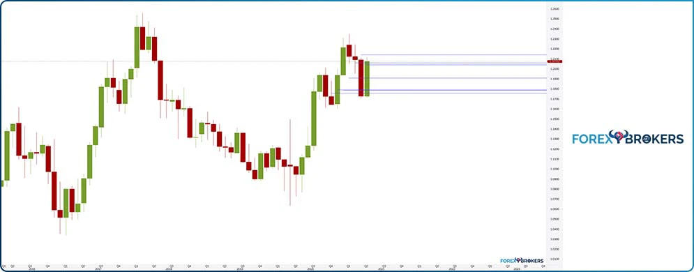
By plotting the dots on the monthly EURUSD chart, we find the horizontal support corresponding to each month, starting with October 2020 until April 2021. Keep in mind that the PL dot level is known in advance for the month to come, as it is calculated based on the previous 3 months’ data.
Suppose we use a straight line and connect the PL dots. In that case, we obtain the PL dot line that has a crucial role in defining the trading styles to use with Drummond Geometry: trend trading, trend reversal, congestion entrance, congestion action, and congestion exit.
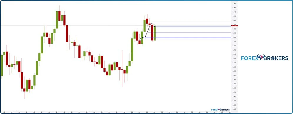
As mentioned earlier, the chart above shows the PL dot line only for a few months back in time, but it can be constructed for all the periods seen in the chart. While the process is time-consuming, by the end, the PL dot line marks the trending periods and the congestion ones and guides the trader on the right side of the market.
Trend Trading
The trend is your friend and every trader wants to be part of it. Many trending indicators exist, but few provide the discipline and clarity needed to ride them without emotions.
Drummond solves this issue by clearly defining what a trend means. When 3 consecutive candlesticks close above or below the PL dot line, the market is in trending mode. Therefore, 3 consecutive closings above the PL dot line show a bullish trend, while 3 consecutive closings below the PL dot show a bearish trend.
Let’s bring back the earlier monthly chart with the PL dot already calculated for the previous 7 months. Based on the PL dot formula described earlier, it is obvious that the PL dot line has a rising angle ever since the COVID-19 pandemic started in March 2020.
But from that moment on, the market did not enter a bearish trend. In contrast, there were a few months when the price closed below the PL dot line (e.g., October 2020, March 2021) and no 3 consecutive candlesticks close below it.
Hence, the trend remains bullish; thus, the dip in the summer of 2020 below the PL dot line was meant to be bought. Once again – a trend changes direction only when 3 consecutive candlesticks close below the PL dot line.
As a tip to consider when spotting trends with the Drummond theory, the dots must move in a straight line in the direction of the trend. If this condition remains in place, reversing the course of the price action is impossible.
Congestion Entrance
Trending conditions with Drummond Geometry mean that the market is able to close for 3 consecutive candlesticks above the PL dot line. In the case of the EURUSD pair, it is obvious that the pair is in a bullish trend starting with July 2020.
The big, green candlestick, having a strong real body, follows bullish price action seen since April 2020. Thus, the averages rose, but not as much as the price did.
But what happens when the market corrects and closes below the PL dot line? That is called the congestion entry and it may be short-lived or long-lived or even lead to a sharp trend reversal.
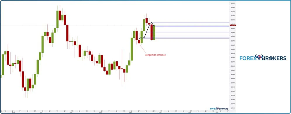
In October last year, the EURUSD pair corrected for the second consecutive month. The move lower was strong enough that the candlestick closed below the PL dot line. When this happens for the first time in a bullish trend, the market is said to enter a congestion area.
Congestion Action
Congestion action refers to the time between the congestion entry (when the market closes below the PL dot line in a rising trend) and exit. Interpreting the congestion action area is a bit tricky, as Drummond was not clear enough on how to define it.
For example, let’s come back to the EURUSD chart. The market closed below the PL dot line, entering the congestion area as shown on the chart above. However, the very next candlestick reverses the previous candlestick’s price action sharply and closes back above the PL dot line – is this candlestick part of the congestion action or part of the congestion exit?
Congestion Exit
To answer the previous question, the best way to deal with such a situation is to stick with the main trend. This is particularly important when the technical analysis comes from the larger timeframes, like the monthly chart here.

Therefore, the bullish trend continues and the congestion area is nothing but a continuation area. If you want, it is a nice way to find out continuation patterns such as pennants, bullish flags or ascending triangles – the market will not reverse for 3 consecutive candlesticks to close below the PL dot line.
Therefore, the trader is always in the driving seat, able to monitor the market closely and react promptly on any entering into or exiting of a congestion area. For example, aggressive traders may use the congestion exit signal to add to the long position.
Trend Reversal
Using the same trending conditions explained earlier. The trend reverses when the EURUSD forms 3 consecutive candlesticks that close below the PL dot line. When that happens, traders should exit the long positions and reverse the trade. From that moment on, the congestion exit is the signal to add on the short position, and the PL dot levels act as resistance on the lower timeframes.
Bullish and Bearish Breakouts with the Drummond Theory
Drummond Geometry puts control back in the hands of the trader. If the trader monitors a market constantly and follows the price action, it is very difficult to end up on the wrong side of it, regardless of how long a congestion period may take.
We may conclude, based on what was presented so far in the article, that the Drummond Theory is mostly a trend-following one rather than a contrarian theory. After all, besides the classic support and resistance levels, the theory gives traders the opportunity to closely follow the price action in a trending market by simply monitoring the declining or rising angle of the PL dots on a chart. Rising PL dots are indicative of a bullish market while falling PL dots indicate a bearish market.
But besides support and resistance levels and trending conditions, Drummond Geometry also indicates possible breakout points, where traders may add to their positions. Such breakout points also act as confirmation points, or checkpoints, suggesting to the trader that the market is moving in the desired direction.
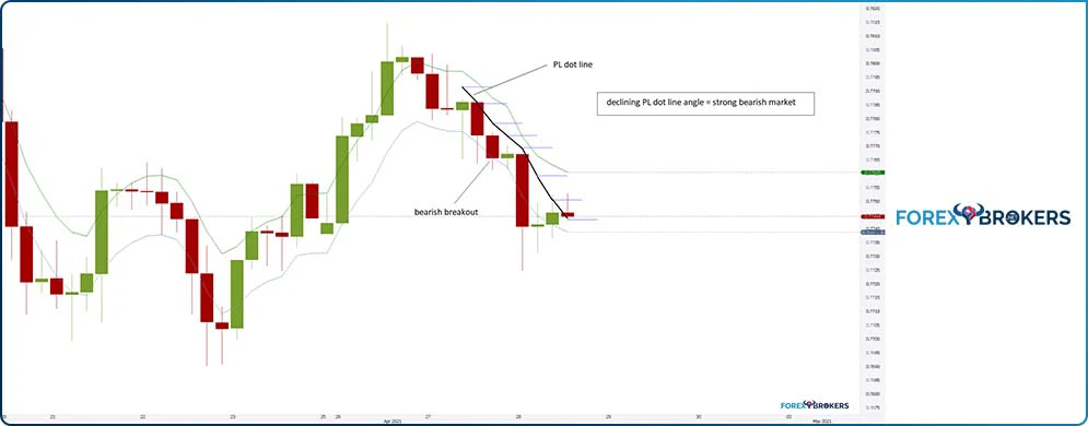
For this, we need to add 2 envelopes to a chart. The chart below shows the AUDUSD 4h timeframe and the most recent price action. We see the pair forming a possible double top close to the 0.78 area and then declining swiftly.

The 2 bands above and below the candlesticks belong to the EMA Envelope indicator. The EMA means Exponential Moving Average and the envelopes follow the price action based on a predetermined standard deviation.
Suppose the broker does not offer the Envelope indicator. In that case, traders may also use the Bollinger Bands indicator for the purpose of this analysis and focus only on the UBB (Upper Bollinger Band) and the LBB (Lower Bollinger Band).
Calculating the PL Dots
The PL dot remains the building block of Drummond Geometry, so the next thing to do after applying the 2 bands is to calculate their value up to the point we have an interest in.
Based on everything discussed so far in the article, we are interested in seeing if a bearish trend is in place. If yes, we want to know where it started; thus, we must calculate the PL dots up to that point.
From right to left, the following PL dot values belong to each of the last 8 candlesticks, including the current one that is still open:
- 0.77432
- 0.77504
- 0.77592
- 0.77693
- 0.77737
- 0.77783
- 0.77854
- 0.77915
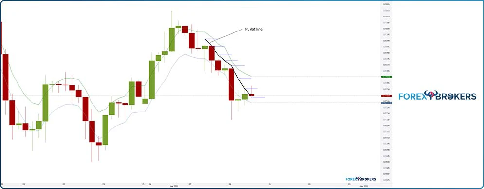
The horizontal blue lines show the level of each individual PL dot. By connecting them using the black line, we have built the PL dot line.
Let’s review the conditions of a bearish trend. First, the market must close below the PL dot line. It did with the first candlestick under the PL dot and probably even with the previous one. For the sake of this analysis, it does not quite matter. What matters is seeing if we can spot 3 consecutive candlesticks that closed below the PL dot line, as that represents our signal that the price is in a bearish market.
Because more than 3 candlesticks are closed below the PL dot line, Drummond Geometry suggests that this is a bearish market. From this moment on, the focus shifts to the 2 envelopes, particularly the lower one.
Conditions for a Bearish Breakout and How to Interpret It
A trending market may advance or decline slowly or aggressively. Based on Drummond Geometry, a bearish or bullish breakout happens when the trend is so strong that the candlestick closes below or above the lower, respectively, upper envelope.
At the same time, the trending conditions must remain in place. Namely, the candlesticks must remain below the PL dot line in a bearish trend or above the PL dot line in a bullish trend.
Let’s have a look again at the AUDUSD 4h timeframe. With the PL dot line in place and with the EMA envelope, we search for a candlestick to close below the envelope while the market is trending to the downside. That is a bearish breakout and suggests more continuation in the same direction.
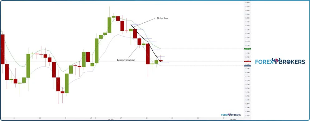
Remember that this is the 4h timeframe and the bearish breakout formed during an already active bearish trend. As it happened, the bearish breakout signal formed 4 hours before one of the most important pieces of economic data from Australia – the CPI data.
The CPI or inflation for March 2021 was due and the market expected 0.9% on the headline inflation and 0.5% on the core inflation. As a side note, core inflation refers to the change in the prices of goods or services over a period, but it discounts energy prices and sometimes even food prices, as the 2 categories are seen as volatile.
Needless to say, the data disappointed. The headline inflation for March 2021 came out at 0.6% on expectations of 0.9%, and the core data at 0.3% on expectations of 0.5%. Because the data was weaker than expected, it had a negative impact on the AUDUSD pair, triggering a sharp move lower.
How to Trade a Bearish Breakout?
The following rules apply to bullish and bearish breakouts with Drummond Geometry. Because our last example used the AUDUSD pair in a bearish trend, the rules will indicate the steps to trade a bearish breakout.
Before anything, keep in mind that before looking for a bearish breakout, the trader must make sure that the following 2 conditions are in place:
- The market is in a bearish trend, as defined by Drummond Geometry.
- Bearish trend - minimum 3 consecutive candlesticks must close below the PL dot line.
- The PL dot line should have a declining angle, with every PL dot making a new low.
The 2 conditions are met on the AUDUSD 4h chart, as seen in the chart above. The next thing to do is to spot the bearish breakout or the candlestick that triggers the signal to sell the market short.
Moving forward, traders should sell at the close of this candlestick, targeting a “breakout” or an accentuated weakness. A bearish or bullish breakout often forms ahead of important economic events, such as the CPI we talked about a little earlier, a central bank decision, or anything else the market deems important.
Any trade must have a stop-loss and a take-profit order, as indicated by the money management system in place. In this case, the stop for the short trade must be placed at the highest level of the candlestick that served as the entry. That is the risk for the trade, and the trader has 2 options for the take profit.
One option is to use a risk-reward ratio of 1:2. That means that for every $1 risked, the trader stands to gain $2.
Therefore, the thing to do is to measure the distance from the entry to the stop and set the take-profit level as double that distance. As the chart shows, 2 candlesticks later, the AUDUSD short has reached the take profit.
Another option is to trail the stop with each candlestick that the chart forms. This way, the trader stands to make more if the breakout is the start of a sustained trend lower. However, the risk is that the market retraces quickly after reaching the 1:2 ratio, so the trader misses the profit.
Conclusion
There is much more to say about Drummond Geometry than this article has covered. The idea was to introduce the concept and explain it so that everybody understands at least the basic principles – support and resistance, the PL dot’s calculation and interpretation, and the breakout points.
But the theory goes beyond that, serving as an important tool to analyze and interpret even bigger timeframes than the monthly chart. For instance, support and resistance levels derived from the yearly chart serve as pivotal levels for traders interested in allocating capital for the year ahead.
To sum up, Drummond Geometry, just like other trading theories, is based on several assumptions that are usual for technical analysis. However, unlike other trading theories, Drummond Geometry works on the currency market without the trader needing to adjust the original concept.
Related Lessons


See more from this category