The Australian dollar (AUD) is a unique part of the Forex dashboard. It represents an economy in a part of the world that many investors want exposure to. Moreover, the stability of the Australian economy and government and the lack of interventions in the currency market makes the Australian dollar an alternative for traders looking for diversification.
In 2016, the Australian dollar was the fifth-most traded currency in the world, after USD, EUR, JPY, and GBP. It offers exposure to the Asian economies, stability, a relatively high-interest rate, and a correlation with commodity markets rarely seen in other currencies.
To understand the importance of the Australian dollar on the global stage, we must cover the particularities of the Australian economy as well as the role Australia has in Asian growth. In this article, we also take a look at China and how it affects the Australian dollar, as well as at some strategies to consider when trading the Australian currency. Moreover, we cover the most important economic releases from Australia, trying to emphasize the ones that really matter for the Australian dollar and that creates potential volatility.
Many institutional investors don’t want exposure to any one particular currency. Instead, they look to diversify resources so that the currency market’s volatility doesn’t affect their bottom line. Therefore, a company sitting on a pile of cash may not want to keep its entire stake in one single currency. Instead, diversifying its portfolio helps maintain the value of its money.
For traders and speculators, the Australian dollar is a curious currency. Its patterns and behavior differ from other currencies, but that can be said for each individual currency. The point here is that each currency has its own way of “moving” on the FX market, and the Australian dollar is no different.
Particularities of the Australian Economy
The 14th-largest economy in the world, Australia has the highest average wealth in the world. Its economy depends on the mining sector, as it is a major exporter of iron ore and gold, among other minerals.
Perhaps the best way to describe the Australian economy’s strength is to mention that during the 2008 financial crisis, it was the only advanced economy that didn’t experience a recession. While the entire world suffered, Australia did well, in part also due to its isolated location from the rest of the world, which this time worked to its advantage.
The performance of the Australian economy is simply impressive. In the last 70 years (from 1959 to 2019), it grew on average by 0.85% per year. Yes, it’s had its downturns, like the contraction of -2% in the second quarter of 1974, but it has also registered incredible growth rates, like 4.4% in the first quarter of 1976.
Recently, it has had a strong dependence on the Chinese economy. China, as it turns out, is the “world’s manufacturer.” It, therefore, needs plenty of raw materials, and Australia is happy to provide them.
But recent years have seen the Chinese economy rising substantially. The new middle class with more purchasing power has new needs, increasing the Chinese domestic demand.
As a result, China began importing even more to satisfy the ever-rising domestic demand. For this reason, the Australian economy suffers or benefits based on China’s economic performance.
The problem for AUD traders is that Chinese economic data is subjective. Economists do not believe all the data released by Chinese officials due to suspicions of manipulation.
For those that do not know, this is a standard way of presenting information under communist regimes. And that’s what China has.
Reserve Bank of Australia
Monetary policy influences the value of a currency. The central bank in every country dictates the monetary policy, setting up the rules of the game for the period ahead.
In Australia, the Reserve Bank of Australia, or RBA, is responsible for price stability and setting the monetary policy. Later in this trading academy, there will be a dedicated article on the RBA and its mandate, as well as how it implements the monetary policy. The article will complement these paragraphs here, but for now, we’re only introducing the particularities of the AUD and how the RBA has managed to make a success story out of this currency.
The RBA began operating as Australia’s central bank in 1960. At that time, the Bretton Woods system was still in place, and the Australian dollar wasn’t free-floating yet. Its free-floating started only in 1983 when the government at the time decided to follow other countries around the world and let the currency find its own value.
Besides setting the monetary policy for the Australian dollar, the RBA fulfills other roles too. For instance, it manages Australia’s gold reserves and provides banking services to the Australian government and other institutions, both local and foreign.
An interesting point to note is that only a few years after the RBA came into effect, Australia changed its currency. Up to that point, the Australian pound had been the currency in circulation. In February 1966, the Australian dollar replaced the Australian pound at a rate of 2 to 1, becoming the legal tender in Australia.
For traders dealing with interpreting historical data, this is an important event that altered historical charts. Technical traders must consider it for their analysis to have any relevance at all.
The Carry Trade
One of the most interesting trading strategies on the currency market, the carry trade, refers to trading a high-interest currency against a low-interest one – more precisely, buying a currency with a high-interest rate and selling a currency with a low-interest rate.
For years and years, the carry trade played an essential role in justifying the demand for Australian dollars. Because the Australian economy outperformed other economies in the aftermath of the 2008 financial crisis, the RBA kept rates at relatively high levels. Even before the crisis, the interest rates were far superior to those in other countries, resulting in a high demand for the AUD.
In contrast, JPY (Japanese Yen), USD, and even the Euro are currencies with low or very low interest rate levels. In some cases (JPY and EUR), the interest rate is even negative.
The broker pays the positive difference for every trading day that a position exists in a trading account, provided, of course, that the trade goes in an interest-positive direction.
For the three currencies mentioned above, what are the corresponding carry trades? Logically, long AUDUSD, short EURAUD, and long AUDJPY.
After the balance in the interest rate differentials shifted (the Fed in the US moved the federal funds rate above the RBA interest rate set for the AUD), the carry trade disappeared. However, opportunities still exist on other currency pairs or on the same pairs but in the opposite direction (e.g., shorting AUDUSD).
The intent of this section was to mention the carry trade as one of the causes for the high demand for Australian dollars for many years, with investors and retail traders alike supporting AUD pairs solely for the sake of collecting positive interest overnight.
Gold and AUD Correlation
Correlations in Forex are another thing to consider when trading in financial markets. They work most of the time, but it is also true that a correlation may cease to exist just like that. We’ll explain more about correlations in future articles in this trading academy.
There’s no such thing as a 100% correlation. The closest one that we’ve seen in the currency market was between the EURUSD and USDCHF. For many years, the Swiss National Bank (SNB) kept the rate of the EURCHF cross artificially at 1.20. That means that the closer the EURCHF cross got to the 1.20 level, the closer the EURUSD and USDCHF correlation came to 100%. Toward the end of the EURCHF peg, the 100% level was finally reached. But that’s an extraordinary example, led by the intervention of central banks.
Correlations do exist between various currency pairs and different markets. For instance, the price of oil and the Canadian dollar (CAD) have a direct correlation. Whenever oil moves to the upside, so do CAD. Similarly, when oil drops, CAD follows.
AUDUSD and Gold – 80% Positive Correlation
As a significant gold producer, Australia ships over five billion USD worth of gold every year. Thus, gold and gold mining activity are responsible for a big chunk of its annual GDP, causing the value of the Australian dollar to move in tandem with the price of gold.
Historically, there’s a positive correlation between the two financial instruments of about 80%. The chart below shows the monthly AUDUSD and XAUUSD (gold) prices.

For many years, the two assets moved in tandem. A rise in gold led to an increase in the AUDUSD pair, and when the price of gold fell, the AUDUSD fell, too.
However, for the last year, we have seen a divergence between the two. In 2019, the Australian dollar kept falling, whereas the price of gold seems to have broken to the upside. It seems the correlation doesn’t work anymore, but if we consider the degree (80%), then the chart still respects the standard median in the financial markets.
Therefore, from this moment on, whenever you consider trading the Australian dollar and especially the AUDUSD pair, have a look at the price of gold and see what it tells you. Most likely, it’ll influence the direction of AUDUSD.
Economic Releases to Watch When Trading the Australian Dollar
In the next four articles, this one included, we take a look at the economic releases that matter for some important currencies other than USD, the world’s reserve currency – the Australian Dollar, the British Pound, the Swiss Franc, and the Euro.
Ideally, traders will gain a comprehensive perspective into each economy and, more importantly, can compare their economic performances. The resulting info allows traders to gain insight into the strength or weakness of a currency pair, at least from a fundamental point of view.
For instance, when using the same parameters as the economic releases presented here, one may find that one country or region performs better than another one. In the end, the price reflects the economic differences, although the market sometimes remains irrational for an extended period. In any case, comparing the economic performances of different countries or regions using the same economic indicators offers traders an educated guess about the intrinsic fundamentals of a currency pair, thereby providing an idea as to where a currency pair might go next.
GDP Annual Growth Rate
The gross domestic product, or GDP, reflects the value of the total goods and services produced by an economy. Depending on the country, the GDP may have different versions and release dates, and the economic calendars show either the annual or quarterly growth rate.
In our case, we’ll use the annual growth rate to keep things at a macro perspective. However, even for interpretations of the yearly growth rate, the focus sits on the quarterly releases.
That means that traders anticipate the quarterly releases and compare them with the release from a year earlier. The outcome shows the growth Y/Y in the same quarter, and at the end of the year, the overall annual growth reveals its full potential.
Using this interpretation is the best approach, as each quarter has its own specifics. For instance, some quarters have more holidays, and some belong to different business cycles, so it makes sense to compare quarterly releases on an annual basis.
As already mentioned earlier, Australia has performed exceptionally well in recent decades. It is still running one of the longest expansions in recorded history, over 30 years in the making.
The annual growth rate in Australia has averaged 3.44% in the last 59 years (1960–2019). Released in the first week of March, June, September, and December, each release covers the previous quarter. For instance, the December 2019 quarterly GDP growth rate release covers the third quarter (Q3) of 2019.
Unemployment Rate
The unemployment rate is one indicator that should never be missing from the economic analysis of a country or region. The lower the unemployment rate, the better for the economy, but don’t try to pursue zero unemployment, as that doesn’t exist.
Full employment doesn’t equal zero unemployment because some people simply do not want to work or don’t need to, despite being of working age and physically able to work.
In Australia, the unemployment rate data is released together with the employment change. In a way, it is similar to the NFP in the United States and the unemployment rate there.
Currently sitting at 5.2% (July 2019), the Australian unemployment rate is below the average of the last 41 years, 6.82%. The data covers the previous month and is released monthly around the middle of each period.
Wage Growth
Wages matter for calculating the inflation pressure in an economy. As all central banks have the mandate to deal with price stability, inflation matters significantly in their decision to cut, hold, or hike interest rates.
The concept of wage-push inflation is not new to economists. When wage trends accelerate, businesses are forced to raise prices. Consequently, a price spiral begins to form, leading to an overall rise in inflation levels.
In Australia, the seasonally adjusted wage price index has been on the rise in recent years, putting pressure on the RBA to act. For instance, it rose 2.3% y/y in Q2 2019. Considering that at the end of 2016 and during 2017, it sat at 1.9%, we can say wage growth is in a rising trend in Australia, and if the trend continues, future developments will put pressure on the RBA to tighten the monetary policy.
However, incorporated wage-push inflation only makes sense when investors combine the result with other productivity measures. Measures such as the unit labor cost, for instance, help identify the right path and whether wage growth will have a say in the overall inflationary pressure.
Core Inflation Rate
Core inflation, also called the RBA Trimmed Mean CPI, is the preferred way for the RBA to measure inflation. It excludes volatile items, therefore providing a more realistic view of price pressure in Australia.
Released quarterly, toward the end of the last month of each quarter, the core inflation rate in Australia recently fell in the first two quarters of 2019 to 1.6% from 1.9% in 2018. This fall justifies the low interest rate level the RBA maintains as well as the dovish tone for future monetary policy. It falls below the RBA’s target 2–3% target, and that says everything about the chart in the next section.
The core rate refers to inflation on everything except food and energy prices. Basically, it shows the changes in prices for goods and services over a predetermined period.
Interest Rate
The interest rate is given various names from central bank to central bank. In some cases, it is the “official policy rate” or the “official interest rate,” and so on. In Australia, the RBA refers to the interest rate as the cash rate. This is the rate at which the RBA is willing to lend money to commercial banks.
Lowering the interest rate represents monetary easing. Commercial banks don’t find low-interest rates appealing and try to gain higher yields by investing in the economy or lending to the general public.
Higher interest rates have the opposite effect. Commercial banks find the yield attractive and, instead of lending to businesses and people, redirect the excess reserves to the central bank, thus tightening monetary conditions.
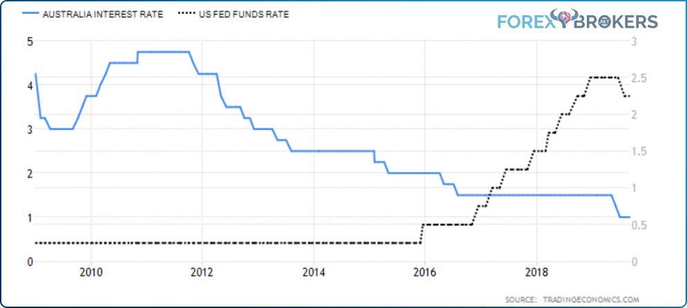
A picture is worth a thousand words, goes the saying. The chart above explains the monetary policy in Australia.
In 2011, the RBA started an easing cycle, sending the cash rate from almost 5% to close to 1%. The chart also shows the federal funds rate in the United States over the same period.
By the time the RBA began cutting, the Fed funds rate was already close to zero. The Fed eventually started to hike as the economy picked up, and the two rates crossed: The cash rate fell below the Fed’s funds rate at the start of 2017.
Why do traders care? Have a look below:
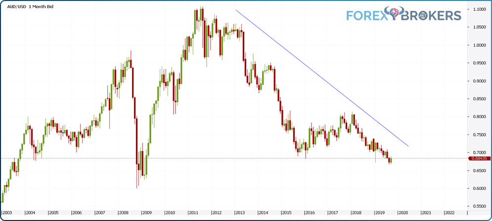
This is the AUDUSD monthly chart covering the period mentioned above. The entire time that the RBA eased and the Fed kept the fund's rate close to zero, and the AUDUSD fell from 1.10 to below 0.9. When the Fed started to hike, and RBA continued to cut, the pair dove well below 0.7.
Balance of Trade
Also referred to as the “net exports,” the balance of trade shows the difference between the value of goods and services exported and the value of products and services imported. In essence, it’s exports minus imports.
When exports exceed imports, it is said a country has a trade surplus, and when not, it’s a trade deficit. From a currency point of view, a trade surplus is beneficial to the currency, as it shows strong economic performance compared with the country’s peers.
However, in some cases (e.g., Germany), excessive trade surplus leads to a “glut.” Governments obsessed with saving fail to reinvest the surplus into the economy via infrastructure projects and so on. Therefore, if not spent wisely, a surplus might have a negative impact, but usually, it bodes well for a country and its currency to have a trade surplus rather than a trade deficit.
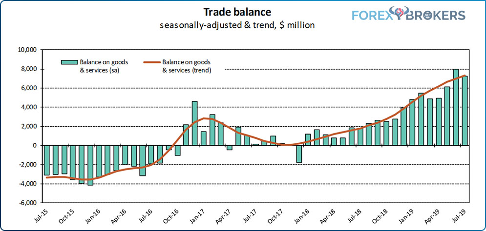
In recent years, we have noticed a seasonally adjusted trade balance in Australia shifting from a deficit to a surplus. Whether coincidental or not, when the RBA began lowering the cash rate, the economy performed better, and the trade deficit shrank and eventually transformed into a trade surplus, with the trend looking solid for the period ahead.
PMIs
In Australia, there are three PMI releases: manufacturing, services, and construction. As we’ve already mentioned in some other articles in this academy, the PMI release is a survey that shows the performance of a given sector. It highlights the sector’s tendency to contract or expand, with the market participants interpreting the fifty level.
Levels higher than 50 show expansionary conditions and are good for a currency. However, don’t expect values over 60 to appear often. If that’s the case, the sector is at risk of overheating, and the regulator (i.e., the central bank) steps in to make sure the economy gets a “soft landing.”
The manufacturing PMI in Australia has averaged 50.79 for the last 27 years, an impressive run by all measures. The services PMI release shows an average of 50.19 for the period 2003–2019. It’s not as good as the manufacturing PMI, but it’s still above the 50 line, despite a shocking 32.5 value in February 2009. This shows that extreme values do appear, although, in developed economies, they don’t stick for too long. As for the construction PMI, it has a special place for those analyzing the health of the housing sector, a vital sector as a determinant for economic growth and a monetary policy influencer.
Leading Economic Index
Calculated by the Westpac–Melbourne Institute, the leading economic index shows the expected economic growth for the proceeding six to nine months. It hovers around the zero level, which has been the average for the last 59 years. It measures different economic indicators, from drivers of economic growth to sentiment measurements, and has a strong impact on the interpretation of the overall state of the economy.
Extreme values of -1.1 or 0.54 appeared in periods when the economy sat on the business cycle’s extremes. Positive numbers send a hawkish signal from the central bank’s point of view, while negative ones send a dovish message. The further the index moves from the zero level, the stronger the central bank’s reaction is likely to be. As an example, in August 2019, the index came in at -0.3, reinforcing the view that the RBA should keep alive its commitment to cut the rates further in October 2019.
Consumer Confidence
We move now to the real engine of any economy: the consumer. Central banks typically cut the interest rate level to support consumer demand. Reduced levels of demand from the consumer lead to deflation, a vicious phenomenon that can cripple any economy.
In Australia, there is a survey that measures economic conditions for the period ahead, typically for the next twelve months. The higher the value, the better it is for the currency, as it shows a healthy consumer base. Consumer confidence had extreme values of 123.94 index points in 2007 and 64.61 in 1990.
Retail Sales
Offering vital consumer-spending data, retail sales in Australia show how the total value of sales changes at the retail level. Released about 35 days after each month ends, the data offers a glimpse into the consumers’ appetite and often indicates whether a recession is to come.
For instance, there has never been a recession with elevated retail sales and robust consumer confidence levels. Therefore, when signs of a downturn from other parts of the financial markets (e.g., Treasury yields inverting) hint at a recession, always look for confirmation in the consumer confidence and retail sales reports. If they have elevated levels, the recession fears likely will fade away over time.
Building Permits
Housing data in Australia plays the same role as in any other part of the world. However, in Australia, the actual economic release has a different name: the number of dwelling approvals. It reached an all-time high of over 31% in 2012 and a record low of -21.8% in November 2002.
A leading indicator of any economy, building permits are particularly important when calculated for new private-housing units. Coupled with the info provided by the construction PMI and new home sales indicators, they offer an educated guess about the performance of the Australian housing sector.
New Home Sales
Perhaps it is not evident at first glance, but the number of new houses sold depends significantly on the interest rate level. In Australia, this is the cash rate.
Because most people take out a mortgage or two to finance the purchase of a house, the interest rate sets the amount to be paid for the life of the loan. Lower interest rates stimulate the housing sector and the number of houses sold.
Of course, the industry needs time to leave room for interest rates to make their effect on the real economy. Expect the impact of rate cuts to not be seen until further down the road, sometimes lagging half a year or more.
The all-time high in new home sales in Australia was recorded in March 2001, with over 20,000 new homes sold, while the record low of 4769 sold came in August 2018.
Tips and Tricks When Trading AUD Pairs
One of the things to consider when trading the Australian dollar is the relatively low liquidity of some of its pairs. The major AUD pair, the one with the world’s reserve currency in its componence (AUDUSD), is liquid enough for all the needs a retail trader might have.
But some other pairs have liquidity constraints, leading to higher spreads as well slippage on execution. Below, we cover some of the aspects to consider before trading AUD currency pairs.
AUDUSD
Particularities:
- one of the key currency pairs of the Forex dashboard
- decent bid/ask spread with most brokers, going well below 1 pip (as low as 0.2 in some cases)
- a pair that moves in robust trends, suitable for trend-trading strategies
- very liquid
- spreads widen during the daily rollover
- correlates positively with the gold price
AUDJPY
Particularities:
- a cross pair
- has a high, positive correlation with the stock market (particularly the U.S. stock market)
- still pays a positive swap (carry trade) despite low rates in Australia (in Japan, rates are even lower)
- tight and stable spreads
- high liquidity
- rarely moves in the opposite direction of USDJPY
EURAUD
Particularities:
- a cross pair with one of the tightest possible ranges
- reflects two currencies that depend on the commodity market (oil in Canada and gold in Australia)
- more suitable for range trading than trend trading
- keep your eyes on OPEC (Organization of Petroleum-Exporting Countries) and any other oil-related events and economic releases
AUDNZD
Particularities:
- reflects the economic and monetary differences between two close economies
- most suitable for range trading
- wide spreads, especially during Australian or New Zealand economic releases
- extremely volatile during RBA and RBNZ interest rate decisions
- sometimes spikes suddenly with little or no reason to explain the move
- brokerage houses working with only one liquidity provider have a hard time offering lower spreads on this pair, especially during economic releases
GBPAUD
Particularities:
- perhaps the currency pair with the wildest ATR of all AUD pairs
- reflects the economic and monetary differences between the United Kingdom and Australia
- given the historical connection between the two economies, GBPAUD benefits from consistent international flows in and out of the two countries
- wide spreads, difficult to trade due to increased volatility
- most suitable for trend trading
- reacts strongly to news both from the United Kingdom and Australia
AUDCHF
Particularities:
- every pair with CHF in its componence is subject to the safe-haven status
- part of risk-off and risk-on moves
- because AUD and the price of gold correlate to some degree, in a risk-off environment, the safe-haven status is amplified, with investors increasing their exposure to gold, CHF, and JPY
- tight spreads, suitable for both range trading (bigger timeframes) and trend trading (lower timeframes)
- deserves special attention when the SNB decides on the interest rate level or changes the monetary policy for the CHF (Swiss Franc)
Conclusion
Australia’s economic strength is reflected in the value of its currency. When the Australian economy performed better than other economies, the Australian Dollar reflected that strength.
In the aftermath of the 2008 financial crisis, the Australian economy was one of the few developed economies that still grew. As a result, the RBA wasn’t forced to cut rates, and the Australian dollar became the go-to currency to benefit from the carry trade.
This article proves, once and for all, that macroeconomics has its place in trading in the financial markets. If traders can put together the pieces of the economic puzzle in a country, the roadmap to trading its currency becomes more evident.
Moreover, armed with that information, traders can compare economies using the same metric. The strengths and weaknesses become even more obvious.
The particularities of the Australian economy presented in this article show traders what to consider when trading the Australian dollar. The cash rate, the RBA’s role, the consumers’ influence, the core inflation, and even the new home sales – all contribute to building the picture of the Australian economy.
The next economy we’ll study under similar metrics is the British economy. The Great Britain pound (GBP) was the world’s reserve currency until it lost its status to the U.S. dollar (USD). It deserves a unique article in this trading academy, serving to complement what we’ve covered on the fundamental analysis spectrum in the Newcomer’s section.


