


432
Traders living in the 21st century might just call themselves lucky. Technological breakthroughs have brought innovations like the personal computer (PC) and the Internet, facilitating access to the world’s financial market.
Nowadays, all brokers offer direct access to the market via a dedicated trading platform — all you need as a trader is an Internet connection, and you may begin trading.
Only a couple of decades ago, trading was a whole different game. Buying or selling currencies or any other financial product, as a matter of fact, was much more complicated.
Unless traders had a seat on an exchange (costly by all standards), people traded by calling their broker and dictating their orders. The broker then instructed the guys on the pitch and waited for confirmation. Next, traders received the confirmation via either fax or telephone. Long story short, it was a slow, expensive process, with brokerage houses making a lot from commissions.
Not anymore. It’s not that the brokers don’t make a profit anymore, but the execution times shrank incredibly fast. With a simple mouse click, currency traders active today can move an impressive amount on the world’s financial markets, and all from the comfort of their own homes, without even picking up the phone or needing to go somewhere.
But trading execution isn’t the only thing that has improved. Charting, or technical analysis, has changed too. Before the PC, traders used pen and paper to track prices.
In fact, most trading theories and patterns were documented this way. Back-testing an idea, though, was challenging, as it took ages to check how a strategy or pattern performed. It all changed with online trading platforms and trading charts.
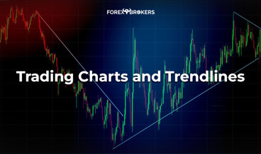
Types of Trading Charts
We’ve already introduced the MT4 platform and its features. It’s now time to check out the types of trading charts it offers, as well as some not available on MT4 unless imported using different indicators.
In any case, importing features is an easy process and can be achieved with the Custom Indicators option offered by MetaTrader4. If you’re not used to MT4, the Internet is full of web platforms that allow you to chart financial markets, either for free or for a small fee (tradingview.com, stockcharts.com).
Before looking at various types of trading charts, let’s define what a chart is. In essence, a chart represents the trace a price leaves behind.
Moreover, a chart is the basis of technical analysis. Without charts, technical analysis simply wouldn’t exist. Back in the day, in the incipient phases of speculation, traders watched the “tape” of the United States stock market and wrote down the price action.
As the prices of a security or commodity came out at constant intervals (every minute or even more frequently), traders looked at how they behaved at certain levels. In a way, without building a chart, this was the embryonic phase of charting and, consequently, technical analysis.
Today, there are so many types of charts that one has a difficult time choosing. If charts track the price action, why do traders need more than one type? After all, that means that all charts show the same thing, right? Well, not exactly.
In this article, you’ll discover the most popular types of charts as well as some not-so-popular charts for retail traders. They all have pros and cons, depending significantly on the trading style and strategy that the chart suits best.
Revolution and Evolution of Forex Trading Charts
Newcomer
Revolution and Evolution of Forex Trading Charts
MetaTrader4 Charts
The easiest way to notice the difference between the different types of charts is to use the same currency pair and plot various chart options. In doing so, it becomes easier to see the differences, advantages, and disadvantages of them all.
The MT4 trading platform offers three types of charts with default settings:
- line chart
- bar chart
- candlestick chart
Before diving into the details of each type of chart, let’s not forget that MT4 offers the option to customize everything on any given chart. That means you can change the background and foreground colors, as well as the candlestick colors, if applicable. We’ve already covered this topic in a previous article dedicated exclusively to the MT4 platform.
To open a chart on the MT4 platform, simply open Market Watch from the main menu. Next, from the list of currency pairs that appear on the left side of the screen, right-click on any currency pair and select the second option from the top, Chart Window.
Moving forward, right-click on the new chart that just opened and select the Properties and then the Common tab. The top-right of that window shows the types of charts offered by the MT4 platform. Clicking the other two boxes results in a change in the type of chart displayed.

There’s also a shortcut. On the shortcut menu above the main chart window on the MT4 trading platform, there are three small buttons highlighting the three options. Below you can find a quick explanation of the three icons:
Line Charts – The Most Basic Trading Charts
To exemplify the different types of charts that exist, we’ll use the same example: the current EURUSD daily timeframe. The simplest type of chart ever created, the line chart, shows just that: a line. While many traders consider it useless, it has a big advantage, as it filters out the noise and the false breaks the market makes.
Effectively, the line on the chart represents the closing price for each period. Because this is the daily timeframe, the line connects the closing value for the EURUSD pair on every trading day.

What about the spikes or dips that regularly appear on charts? Well, the line chart ignores them altogether. For some traders, this means ignoring the market noise, allowing them to focus more on the closing than on what happened before that.
Traders may customize the line chart as they want, making the line thinner or thicker, depending on their preferences. Obviously, the color can be changed too.
Bar Charts – The Oldest Type of Charts
As the title suggests, the bar chart is the oldest type of chart that exists. Veteran traders still prefer it, and therefore it is found on all trading platforms.
Bar charts show the entire price action during the specified period. Another difference between the bar chart and the line chart is that bars (representing periods) also show the opening price. Therefore, any bar from a bar chart shows the opening price (on the left side of the bar) and the closing price (on the right side of the bar). The next bar then has the same opening price as the previous bar.
That is, of course, if no gap exists. However, due to the high liquidity in the currency market, gaps rarely occur during the trading day or week. They mostly form over the weekend at Monday’s opening.

Above, you can see the same EURUSD daily chart, only this time showing bars for each trading day. Each bar shows the opening and closing levels, and in between these levels, the chart shows the price activity during the day.
For some traders, the price activity between the opening and closing of a period is essential. For instance, trend traders that draw trendlines and expect the price to never break them like to see any possible piercing.
- Line Charts vs. Bar Charts
In the case of a line chart, if we draw a trendline connecting the top with the lower highs, we see a clear descending trend. A bearish trend looks like below:

The clear trendline (the blue line) highlights the bearish trend. The price doesn’t even ever pierce it, not between the two points used to draw the trendline nor afterward.
However, using the same trendline but a different type of chart, things look quite different. In fact, the trendline used on the chart above becomes useless on a bar chart.

In order to use the same strategy and connect the highest high with the next lower high, the bearish trendline must change its angle to a more abrupt one. However, that means that a future pullback would have an easier time breaking it than in the case of the trendline derived from the line chart.
Candlesticks Charts – The Most Popular Trading Charts
Believe it or not, candlestick charts have only relatively recently become popular. Only a couple of decades ago or so, Steve Nison introduced the concept of Japanese candlesticks to the Western world.
Up until Nison’s presentation of how powerful candlestick patterns are, Western traders used what we now call “classic technical analysis.” That means the main patterns used were the head and shoulders, double and triple tops, etc., and the common trading theories like the Gartley or the Elliott Waves Theory.
But Western traders quickly noticed the advantages of the Japanese candlestick patterns over the classic technical analysis patterns. Specifically, both the continuation and reversal patterns in the Japanese approach to technical analysis take way less time than in the classic ones. Various future articles in this trading academy will cover Japanese patterns in detail.
- Candlesticks Charts vs. Bar Charts
Candlestick charts differ from bar charts in the sense that the opening and closing prices aren’t signaled on candlestick charts. The levels do exist, though, and traders can simply use the OHLC (Open High Low Close) information offered by the MT4 platform.
For this reason, candlestick charts always show more price action on the screen, meaning more periods fit the screen compared with a bar chart.
A candlestick chart displays all the price action during a candlestick’s formation. However, the main distinction from a bar chart is that everything appears on the horizontal.

Traders may customize everything in the chart above. For instance, the classic colors representing bullish and bearish price action are green and red. However, traders can use any color combination they want.
- The Elements of a Candlestick
A single candlestick reveals a lot about the price action, both current and future. The Japanese candlestick theory looks at patterns formed by one, two, or more candlesticks. However, fewer periods exist in all Japanese patterns when compared with classic patterns.
Any candlestick has three elements:
- upper shadow
- real body
- lower shadow
The length and shape of the candlestick offer a clue regarding future price action. Here’s a group of candlesticks from the chart above:

The first candlestick from the left has a long upper shadow, a very small real body, and a long lower shadow too. These elements appear on every single candlestick on a candlestick chart.
All candlesticks that follow in the example above are different. Either the shadows have different lengths, or the real bodies have different colors, but each candlestick tells a different story.
As you’ll find out in future articles dedicated to Japanese candlesticks, one or a group of candlesticks is enough to signal trend continuation or reversal. In other words, especially on bigger timeframes, the shape of the candlestick matters for traders, as it offers an educated guess about where the price might go next.
Other Types of Trading Charts
The charts presented so far have been classics. Apart from the candlestick chart, which is a relatively new approach to charting financial markets, there’s not much difference in interpreting and trading such charts.
However, the PC brought some exciting changes to the charting landscape. New charting techniques (e.g., Renko, Heiken Ashi, Kagi) and old ones (e.g., point and figure) suddenly revived traders’ imaginations, as it became easier to use them due to computers’ fast compiling of data.
In some cases (e.g., point and figure), we’ll look in detail at the concepts and how to trade in the currency market in a future article. Now, though, it’s time to explain how other types of trading charts work and how to interpret them.
Renko Charts
Coming from Japan, Renko charts look like a continuous series of bricks. In fact, “renga” in Japanese means “brick,” hence the name of this chart.

This is the same EURUSD chart we’ve already seen using the three other chart options: line chart, bar chart, and Japanese candlesticks. Above, we can see right from the start that the Renko chart is telling us something different.
For a clearer view, let’s bring back the daily candlestick chart to have the two on the same page for easy comparison. This time, we’ll just make sure the entire screen is filled with candlesticks.

Notice any differences? The high on the Renko daily chart is 1.25, while the high on the is 1.15. However, both charts are full of Renko bricks or candlesticks, respectively. How is that even possible?
The thing is that Renko charts use so-called boxes. More precisely, it uses a box size for each market in a similar manner to what a point and figure chart shows.
In other words, the Renko chart plots a new brick only if the price exceeds the box size. For instance, for the stock market, the size of a Renko box may be $0.2. That means that the chart plots a new brick only if the market exceeds the minimum box size.
Obviously, there’s a strong correlation between the time frame and the size of the box. For example, when trading the EURUSD pair, using a box size of 10 pips results in an irrelevant chart because the pair always moves more than ten pips. The idea when using Renko charts is to filter out minor price fluctuations considered irrelevant.
Setting Up a Renko Chart
The problem with the earlier statement comes from the large number of currency pairs that exist. Also, there are too many financial markets, as well as individual equities. How do you know which box size works best in each case?
Again, indicators help. Trading platforms these days use the average true range, or ATR, with a default setting of 14 periods to automatically set the size of a box.

- What is the ATR?
Another indicator built by J. Welles Wilder, Jr., for the commodity markets, the ATR’s purpose is to measure a market’s volatility. It is a smoothed moving average of true range values for the recommended 14 periods.
Interpreting Renko Charts
Keeping the above in mind, each box on the EURUSD Renko chart presented earlier is created only if the market travels for one day more than the ATR of the previous 14 days. If it does, the chart plots a new brick. If not, the chart remains unchanged. This is how Renko charts filter the noise in the market and, some traders say, show only the relevant information.
Only if we zoom out on the candlestick chart can we see the entire price action considered by the Renko chart. In other words, the Renko chart comprises, in a nutshell, the three years of market activity on the regular candlestick chart.

How to Trade with Renko Charts
The reason why Renko charts were invented was to make it easier for traders to spot the market trending conditions. By filtering the moves using the ATR indicator, the chart reveals the real course of action, making it easier for traders to end up on the right side of the market.
You are already familiar with the rules of a trending market. In a previous article in this section, we introduced the idea that a bullish trend has a series of higher highs and higher lows, while a market in a bearish trend keeps forming lower lows and lower highs.
With a Renko chart, these series become more evident. It’s not only about the market spiking to get the highs of the previous swing or dipping to trigger the lows in the previous downward move. Instead, it’s about a Renko brick closing above the previous lower high or below the previous higher low. If that doesn’t happen, the trend remains intact and healthy, and traders make the most of it.

According to the daily Renko chart, since the 1.25 high in early 2018, EURUSD has sat in a perfectly defined bearish trend. All it took traders to end up in profit was to remain disciplined all this time.
The cherry on the cake for a trade like this one is that shorting the EURUSD pair all this time (over one and a half years) paid a handsome positive swap. Because the European Central Bank (ECB) keeps the interest rates below zero, the easy monetary policy conditions ended up widening the interest rate differential between the Fed in the United States and the ECB in Europe. All this time, the ECB kept the interest rates in negative territory, and the Fed raised them, allowing short traders to receive a positive swap for every trading day they kept their shorts open. How’s that for a trade?
Heiken Ashi Charts
Yet another chart from Japanese technical analysis, Heiken Ashi, means “average bar.” The key to understanding Heiken Ashi charts is to know how the charts plot their candlesticks.
Each candlestick represents an average of some previous candlesticks. In this way, the Heiken Ashi chart filters some of the market noise (not like the Renko charts) and doesn’t show the exact opening and closing prices for a period.
Because of that, traders find Heiken Ashi charts suitable for interpreting market trends but on lower timeframes. However, we’ll still use the EURUSD daily chart to illustrate the difference between all the types of charts we’ve mentioned in this article.
Setting up the Heiken Ashi Chart
The MetaTrader4 platform offers the Heiken Ashi chart option – you just need to know where to find it. Simply use the Insert tab from the main menu. Next, from the drop-down list that appears, choose the Indicators option. On the bottom of the Indicators list, choose Custom. Finally, select the Heiken Ashi option, and MT4 will automatically transform the chart from candlesticks (in this case) to Heiken Ashi.

Doing so renders the chart useless, as this is an indicator that transforms the way the chart is displayed. The problem is that it considers the settings in the Properties tab related to the chart setup and combines them with the properties from the indicator’s setup.

To fix this, right-click on the chart and select the Indicators tab. From the pop-up window, simply use the Edit button and change the colors of the Heiken Ashi candlesticks.

If you switch the colors to red and black, the correct Heiken Ashi chart will appear like the one below, with the bullish candlesticks in black and the bearish ones in red.

Trading with Heiken Ashi
The main reason why traders use the Heiken Ashi chart is to filter false information the market might provide. For example, a regular Japanese candlestick may show contradicting information during the consolidation of a triangle, leaving traders not knowing if the triangle’s break is legitimate or just another false market move. Heiken Ashi helps in this regard, as well as with pennants, wedges, and other classic technical analysis patterns.
An example can help. Below, we can see one of the last lower highs EURUSD made on the classic Japanese candlestick chart. The triangular pattern shows both bullish and bearish candlesticks, making it difficult to interpret the break when it comes.

A close look at the Heiken Ashi chart reveals that all candlesticks in the triangular formation were bullish (black), and the candlestick that signaled the break changed its color to red (bearish), confirming the move.
Kagi Charts
Like Renko charts, Kagi charts reduce market noise. Another similarity is that it is a chart independent of time, plotting a new value only if things happen in the market. If not, the Kagi chart remains unchanged.
Kagi comes from Japan. When the local stock market began trading in the late 1800s, traders developed Kagi charts to help them better understand the market moves. These charts show in an effective way where the price goes, bringing valuable information to traders.
There’s no time axis on a Kagi chart. Instead, Kagi charts display vertical bullish (green) or bearish (red) lines connected by short horizontal ones.

Interpreting the Kagi Chart
There are two things every trader must consider when looking at a Kagi chart:
- The color changes from red to green or from green to red when the price reaches the high or low, respectively, of the previous vertical line.
- The direction changes only when the price exceeds a preset distance.
Just like in the case of Renko charts, the ATR (14) helps define that distance. However, back in the day, traders used proportions, such as a 4% drop in the value of a stock, for the Kagi chart to change direction.
How to Trade with Kagi Charts
In addition to filtering out useless market moves, Kagi charts have a straightforward interpretation. Like the Renko chart, traders mainly use them to ride trends.
However, there’s a difference. This time, the focus is on when the vertical lines change colors, not on the classic series of lower lows and lower highs (in a bearish trend) or higher highs and higher lows (in a bullish trend).
The Kagi chart below shows the price action on the EURUSD pair for the last two and a half years. Because it uses the ATR indicator, it filters out the noise and only presents the relevant information.

Two trends formed during these two and a half years: one bullish and one bearish. From left to right, let’s go through the chart to understand its formation and, more importantly, how to trade with it.
- Riding a Bullish Trend with a Kagi Chart
We see the market forming green, vertical lines. The horizontal lines retain the same color, meaning the price action didn’t reach the low on the previous vertical green lines.
As a rule of thumb, every time you use a Kagi chart, the trend reverses when there is one full vertical line of the opposite color that closes beyond the line in the territory it ends. Sound complicated? Let’s go over the chart above.
From left to right, the only time when a full vertical red line (opposite to the primary, bullish trend) appears somewhere in November 2017. More than six months after the bullish trend started, the Kagi chart plots a red vertical line.
The next thing to do is to draw an imaginary (or even physical) horizontal line and check the bullish line whose territory the red line closes into or beyond.
In the first example, the red line can’t break the lows given by the green one. Hence, the bullish trend should be expected to resume. And it did!
- Reversing a Bullish Trend with a Kagi Chart
We’ve already laid down the rules – let’s just check them moving forward on the right side of the chart. At one point, the market forms a long, red vertical line.
A closer look at it reveals that it closes below the full, bullish, vertical line it corresponds to. Hence, this is a valid bearish reversal, and bulls start closing their longs and going short.
If we look further at the right side of the chart, using the same principles, we see the market fails to invalidate the bearish trend. In fact, the trend remains valid to this day, as any bounce so far hasn’t been meaningful enough to invalidate it.
Point and Figure Charting
There’s little known about point and figure charts in the retail trading world. If anything, using such charts seems boring and useless for impatient retail traders. However, the truth begs to differ.
Point and figure charting is one of the most interesting charting techniques ever invented. It evolved over time as technical traders picked up the work from where the previous generation had left it.
Nowadays, with the help of computers, traders can easily switch from a classic chart (line, bar, candlestick) to a point and figure chart. We’ve already seen in this article how some of the charts presented distort the element of time in the sense that they filter out irrelevant market moves and consider only the relevant ones. The point and figure chart are no different.
It has, however, some unique characteristics. It distorts the time even more than the Kagi or Renko charts. In the Kagi and Renko charts, which consider the ATR before plotting a new line or brick, when a new line or brick appears, it is plotted on the right side.
However, the point and figure charts use the vertical and only the vertical. This way, the price action for several years appears on a single chart.
- Explaining the Point and Figure Chart
For now, we’ll keep it a secret how to trade with the point and figure chart, as that subject belongs to a different category in our trading academy. However, it is worth mentioning now what makes up a point and figure chart.

The chart above is still the EURUSD pair, only that this time it shows the price action from May 2010. That’s right, over nine years of price action on a single chart.
Any point and figure chart have Xs and Os. These are bullish and bearish boxes, and modern trading platforms determine the size of the boxes using, again, the ATR.
In the early days of point and figure charting, traders used a specific box size for each individual security. Truth be told, there weren’t as many financial products and markets as there are today. The ATR seemed to solve that issue quite successfully: A box represents the distance of the ATR (14).
A key thing to remember when using point and figure charts is what type of reversal condition it has. The most popular reversal condition is a 3-box point and figure chart, like the one above.
For instance, imagine a bullish trend. That’s a vertical line with Xs on top of each other. For the chart to plot a reversal – and O line – the real price action must exceed three times the size of one box or three times the ATR (14).
If that happens, the point and figure chart plot an O below the last X to show the reversal. More details about point and figure charting are to come later in this trading academy. Hopefully, this section is enough to demonstrate how powerful this type of chart is.
Conclusion
This article has covered the most relevant types of charts that exist. But that doesn’t mean that any one chart is better than another.
In the end, it doesn’t matter which information is used: All that matters is ending up trading successfully. Some traders open positions on the currency market by simply interpreting fundamental events or economic news.
For technical traders, though, knowing what types of charts are out there is vital. Because the same strategy can yield a different outcome on each chart, the challenge is to find out what type of chart suits your plan best.
But if traders don’t know the available charts out there, how can they decide that? Hopefully, this article solves this issue.
One more thing before finishing up. The types of charts in Forex trading here work on all markets, not only when trading currencies. They function similarly, presenting the data traders need to succeed.
Related Lessons


See more from this category