News of all kinds influences the financial markets. There’s a specific order in the way economic news is made known to the public, so market participants know in advance what to expect and when. Trading the news has become a strategy for many retail traders and professionals alike, as most strong market moves and trends originate as a result of economic news releases.
We didn’t mention the currency market in the first paragraph but rather news in general. The reason is that all financial markets (bonds, stocks, currencies, options, etc.) react to increases in volatility in the other markets. For instance, a particular news release may refer directly to the currency market (e.g., a central bank issuing a dovish statement, which is bearish for the currency) but create strong flows in correlated markets like the stock market.
Most retail traders are scalpers. That means they go in and out of the market for very quick profits when possible. While this is one of the most difficult trading strategies, it appeals to traders because of the possibility of making a profit fast.
When asked why people do not follow his investment strategy, Warren Buffet, the Omaha super-investor, replied that people don’t like to get rich over time. They want to get rich fast, and for this reason, most of them end up failing. Buffet explains perfectly what trading the news does to the retail trader. But that doesn’t mean that all trading strategies based on economic releases are doomed to fail.
In fact, economic news serves a bigger purpose. Even technical traders consider the time within the trading day/week/month that a piece of economic info comes out.
Introducing the Economic Calendar
Because the currency market spends a lot of time consolidating levels, reactions to economic data are essential for the overall outcome of a trade. Early positioning on a possible strong trend improves the risk-reward ratio significantly.
Luckily, part of the structured order that we see today in the world of financial markets is due to the economic calendar. This is free information available to anyone with interest in trading in the financial markets, with many financial websites and brokerage houses displaying it on their homepage.
As it turns out, each major economy releases pieces of economic data in a specific order to avoid chaos in the financial markets. Depending on the importance of the release, the markets (especially the currency market) react very fast.
One of the essential characteristics of the economic calendar is allowing traders to know in advance what’s going to happen. Still, the market is taken by surprise many times, as interpreting an economy is a tough job.
For fundamental traders, the economic calendar provides all the information necessary to analyze an economy. From unemployment data to the gross domestic product (GDP), from housing data to industrial production, everything is there. The fundamental trader’s job is to put together all these pieces of information and come up with a bearish or bullish view of an economy and currency.
Next, traders take their view on the market or, in other words, put their money where their mouth is, in the sense that at the end of the fundamental analysis (which mostly consists of interpreting economic news), fundamental traders place a trade to buy or sell a specific financial asset.
How to Interpret the Economic Calendar
The economic calendar comes in various forms, depending on the source that provides it. However, all economic calendars have the same structure.
Consider the image below, which shows the economic calendar provided by one of the major websites (forexfactory.com) dedicated to such things. Other similar sites also exist, and the interpretation is identical.

The image shows the economic news for Tuesday, August 27. What’s important to remember is that the format is the same for all days, and only the number of economic events and their importance differ.
From left to right, let’s have a look at the image above. It starts with the date. Next, to the right, there’s a column stating the time of the release. Note that traders can set the time according to the time zone they’re living in. In this example, the time is EST, the New York time zone.
Moving farther right, there’s the currency column. It shows the currency that the news refers to, making it clear to traders right from the beginning which market will be affected the most.
The impact is substantial, too. On this economic calendar, there’s a color code to mark the importance of each economic news release. More precisely, this represents the likelihood that the news will move the market.
Further on the right side is the description of the economic news releases, followed by the “detail” column. As you’ll find out later in this article, this column can be expanded to offer all the details necessary for interpreting the economic data.
The actual, forecast and previous columns reveal the present, future, and past. Specifically, the “previous” column shows the most recent release. The forecast column shows economists’ forecasts for the current data, and the actual column shows what the release has actually done.
Yellow Economic News
Obviously, the key for traders is to get actual data that is as close to reality as possible. If they can, they will end up on the right side of the market. But as for economic data that appears in yellow, it’s not that important.
Also called third-tier economic data, news in this category complements the fundamental analysis already in place. Rarely does a news release marked in yellow move the market on its own.
In other words, fundamental traders interpret the relevant data and then look for confirmation in the second and third-tier data. For instance, in the image above, let’s take the second economic release from the top: German Final GDP q/q.
The specification at the end of the description (q/q) signals that this piece of economic data comes out every three months. Released quarterly, the final GDP in Germany, the largest economy in the eurozone, is unlikely to deviate from the consensus. For this reason, the news is yellow in the economic calendar, and the actual results don’t deviate from the forecast.
In other words, this is a non-event for the euro, but the confirmation that the GDP in Germany is shrinking quarter on quarter complements the potential bearish view that a fundamental trader might have. For example, if the unemployment rate in the eurozone also falls and the Purchasing Managers Index (PMI) begins declining, a declining GDP in Germany confirms the eurozone economy’s poor performance, reinforcing a potential bearish view.
Third-Tier Data of the Economic Calendar
We’ll give a few examples from each category of data that appears in the economic calendar. The idea is to provide insight into what matters and what is less important for analysis and why, in the end, traders need as much information as possible to solve economic puzzles. Moreover, the examples cover relevant economic releases from the most important economies.
- AIG Manufacturing Index (Australia)
Australia, the Australian Industry Group (AIG) Manufacturing Index is third-tier economic data. It does show, though, how the manufacturing industry is doing in one of the most important economies in the world.
For investors, it is relevant when trading the Australian dollar, especially when considering the entry point for a longer-term perspective trade. It is released during the Asian session of every first business day after the previous month ends.
A survey of over 200 Australian manufacturers, the AIG Manufacturing Index, offers a view of the manufacturing sector, as respondents provide information about employment, production, inventory, and so on.

- Construction PMI (United Kingdom)
While the PMI data is usually vital for any economy, in some parts of the world, there’s a dedicated PMI for the construction sector. That’s the case in the United Kingdom and Australia, where three PMIs exist: manufacturing, services, and construction.
However, in the overall GDP, the construction sector plays a smaller role compared to manufacturing or services. The difference is even more acute when the economy is a service-based one like the United Kingdom’s economy. For this reason, the Construction PMI is considered a third-tier piece of economic data, important but with little or no influence on the GBP pairs.
From time to time, though, even the smallest clues matter. During the 2008 financial crisis that started from the housing bubble in the United States, investors kept their eyes on all housing data around the world. At that point in time and the period that followed, the Construction PMI and housing data releases were followed by increased market volatility.

- PPI m/m
Released by the Eurostat every month about 35 days after the month ends, the Producers Price Index (PPI) shows the change in the price of goods and services sold by producers. Usually, any piece of data referring to a change in prices (inflation) receives attention from traders, as it may have repercussions on what the central banks will do with the interest rate level.
However, in the eurozone, the PPI is a piece of third-tier data because the Harmonized Index of Consumer Prices (HICP) is the favored indicator of the ECB when interpreting price stability. Nonetheless, many traders look at the PPI to form an educated guess about how the HICP will look. The thing is that if inflation rises or falls, the PPI is the first economic release to indicate that, as producers pass it on to consumers in the end.
Orange Economic Data
As you have probably already guessed, economic data marked in orange is more important. Already in this category, the data can move the market on its own.
Second-tier data and orange economic news releases come from all parts of an economy. As the image from earlier shows, most central bank members’ speeches belong to this category, too. In other words, not only economic data but also other news releases have an impact on markets.
As for news marked in yellow, the market doesn’t react if the actual differs from the forecast. In fact, the yellow data is mostly ignored, with traders using it only to complete the fundamental picture of an economy.
However, things change when it comes to news marked in orange. Even small differences between the actual and the forecast are enough to create a market reaction.
In the picture from earlier, an MPC member from the United Kingdom is about to give a market speech. Remember that central bankers hold speeches in between monetary policy meetings to reinforce the message or make sure the market clearly understands it. MPC stands for Monetary Policy Committee, the Bank of England’s ruling body.
Judging by the color code, the MPC member’s speech is more important for the GBP than the High Street Lending and the BRC Shop Price Index y/y (the other two GBP-related economic news releases appearing in the earlier image).
As a rule of thumb, central bankers’ speeches are given heightened attention by market participants, and for this reason, they represent second-tier data. But even among central bankers, there are differences, and when the heads of critical central banks hold a speech, that event is marked in red.
Second-Tier Data – Examples
Already in this category, there are some key economic events and releases. Market participants carefully watch the evolution and whether the support and resistance levels will hold or give way as a result.
- Trade Balance
Released in Australia about 35 days after the month ends, the Trade Balance shows the difference between exports and imports for the reported period. Also called International Trade in Goods and Services, the Trade Balance reveals a vital facet of the economy.
The bigger the exports are, the better since the currency tends to outperform on a positive Trade Balance release. In Australia, the release is important because a big portion of Australian exports goes to China. Because the Chinese economy has a strong influence on the global economy, many traders look at Australian exports to China to try to position themselves on the right side of the market.
- OPEC-JMMC Meetings
This is a good example of an economic event having a substantial impact on all financial markets. We’re not talking about an economy or currency anymore but about a market (the oil market) and its implications on the overall financial market.
Later in the trading academy, there will be a dedicated article on the oil market and its relevance when trading in the financial markets. For now, let’s just mention that OPEC stands for the Organization of Petroleum Exporting Countries, and its 12 member countries meet regularly to discuss production levels. Moreover, as this event shows, sometimes OPEC holds meetings with the representatives of 11 other oil-reach nations in the Joint Ministerial Monitoring Committee (JMMC).
The price of oil affects inflation, and central banks react to changes in inflation. Moreover, some currencies, like the Canadian dollar (CAD), have a direct relationship with the price of oil. Thus, such an event has a substantial impact on financial markets.
It may be that the meeting’s outcome is irrelevant to the overall price action, but it also may be that the market is holding tight ranges and looking for a breakout on an announcement that production levels have increased or decreased. For this reason, the event is marked as second-tier data on the economic calendar.
- Preliminary UoM Consumer Sentiment
A monthly economic data release out of the United States. The Preliminary UoM Consumer Sentiment always hits the wires on a Friday. UoM stands for the University of Michigan, and the release is a survey that measures financial confidence as a leading indicator for consumer spending.
Consumer spending is an essential wheel in any economy, as when it stalls, it spells trouble for the overall economy. In fact, low consumer spending levels lead to declining inflation levels and eventually to deflation, prompting the central bank to intervene.
It’s easy to see, then, why consumer sentiment is categorized as second-tier economic data in importance, offering more clues about the direction of the economy. In the case of the Preliminary UoM Consumer Sentiment, it refers to the United States economy and impacts the world’s reserve currency, the USD.

Red Economic Data
This is the data to keep in mind before starting the trading week or month. The market moves regardless of what the actual column shows compared to the forecast.
For example, if the ISM Non-Manufacturing PMI in the United States is forecast to reach the 60 mark, that’s a bullish or hawkish statement already. By the way, the forecast for all economic releases is made by a group of economists from each market giving their assessment of the economy. The average of their opinions forms the forecast that appears on the economic calendar.
So, the forecast represents the view of a panel of economists about a specific market sector or piece of economic information. The standard interpretation for the ISM is that any value above 50 shows the service sector expanding.
If the economists forecast a value of 60, that’s bullish. On a release that confirms such a forecast, the market may rally in relief or in confirmation that the economy is indeed doing that well. In other words, even if the actual doesn’t exceed the forecast, on an economic event marked in red, the market moves anyway.
Alternatively, it may not actually move at all if other things overshadow it in importance. It may be that an election is insights, such as the presidential election in the United States, or an important referendum, like the Brexit vote.
In such cases, market participants simply ignore the economic data and wait for the event to pass. Once the other factors of the fundamental analysis pass, the focus turns back to the economic data.
First-Tier Economic Data – Examples
These are the real deal. The news or events marked in red are the ones no trader wants to misinterpret. Nonetheless, there’s no guarantee that the market will move in the right direction, even if the actual release confirms the expectations.
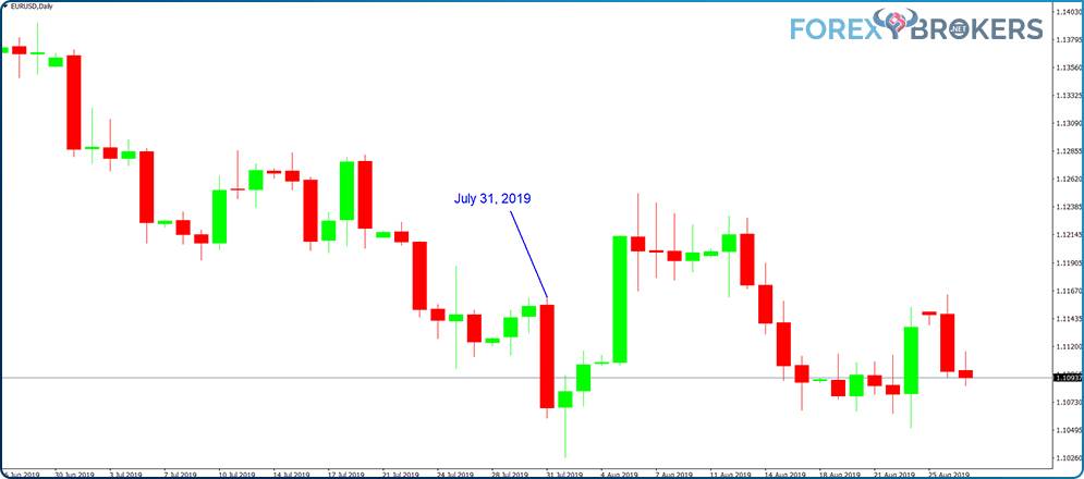
The chart above shows the daily timeframe for the EURUSD pair. One particular candlestick deserves our attention in pointing out the market expectation and reaction.
On July 31, 2019, the Federal Reserve of the United States cut the federal funds rate. On any economic calendar, the standard interpretation of such an event is bearish for USD. In other words, the normal reaction when interpreting the economic calendar would be a higher EURUSD or a green candlestick.
Instead, as the chart shows, the EURUSD pulled a red, bearish candlestick for the day. Instead of falling, USD rose, even though the Fed cut the rates. In such cases, it is said that the rate cut or economic news has already been priced in by the market. However, no one really knows what’s priced in and what isn’t, and that makes the interpretation of economic calendars difficult.
- Core Retail Sales m/m
Released in the United States, this release represents first-tier economic data about the United States economy. Strongly related to consumer spending, it shows the health of the American consumer and offers a clue about the economic strength of the US.
Released monthly, the Core Retail Sales data discounts automobile sales from the total number of retail sales because automobiles make up about 20% of the total retail sales but tend to distort the data. This offers a clearer, more stable view of the overall retail sales in the United States.
- CPI Y/Y
Released in the United Kingdom and affecting the GBP, the Consumer Price Index (CPI) tracks the changes in the prices of goods and services purchased by consumers. Because most of the overall inflation is in consumer prices, the CPI tends to have a strong impact on the monetary policy in the United Kingdom.
It has a particularly strong influence on the GBP’s value because the Monetary Policy Committee (MPC) in the United Kingdom doesn’t issue press statements or hold press conferences if it keeps the interest rate steady. Therefore, traders try to read the situation from other economic releases, like the CPI Y/Y.
- German Flash Services PMI
Not many economic news releases out of the eurozone fall under this category. To the surprise of many, the European Central Bank (ECB) meetings and press conferences mostly set the direction for the euro pairs.
However, a few releases stand out in terms of importance, with the German Flash Services PMI being one of them. This is a regular PMI that refers to the largest (and strongest) economy in the eurozone. That means that when the German Flash Services PMI shows signs of contraction, chances are that the entire eurozone economy will contract as well.
Also, considering that the German economy is the world’s third-largest exporter (after the United States and China), a slowdown in Germany hints at a slowdown in global growth. Portfolio managers and investors find it valuable to know when the global economy stalls, as that affects the flows in and out of various markets (e.g., emerging markets).
Released monthly, the PMI constitutes a leading indicator of economic health, and the euro pairs react strongly when the actual figure misses the forecast or when the actual release beats the economists’ expectations.
Expanding the Details to Find Out More
One of the greatest things about the economic calendar is the information provided in the Details tab. This tab offers a detailed view of the economic data for events that might influence the market.
From time to time, certain events matter more for the market than economic releases. When that’s the case, it makes sense to check the details on the economic calendar to find out more about the event.
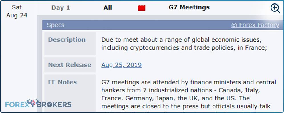
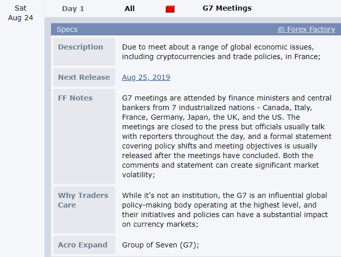
The G7 meetings are such an event. The economic calendar only shows that Day 1 has started and marks the event in red, so traders are aware this is an important event.
By expanding the details tab, we find out why it is crucial, as well as the possible implications for traders around the world. The meetings of the Group of Seven, usually known as G7, are meetings of global leaders on topics like economic issues, trade policies, and so on. The meetings influence global policy and, very importantly, take place over the weekend!
That means that press conferences and any other kinds of information at the G7 provided over the weekend have the power to influence the market opening levels on Monday. Therefore, traders that know in advance that a G7 meeting will take place (by constantly checking the economic calendar) may choose to close their positions ahead of the weekend or to loosen up the exposure on their trading account so that they do not suffer any unwanted drawdowns.
Historical Data to Interpret from the Economic Calendar
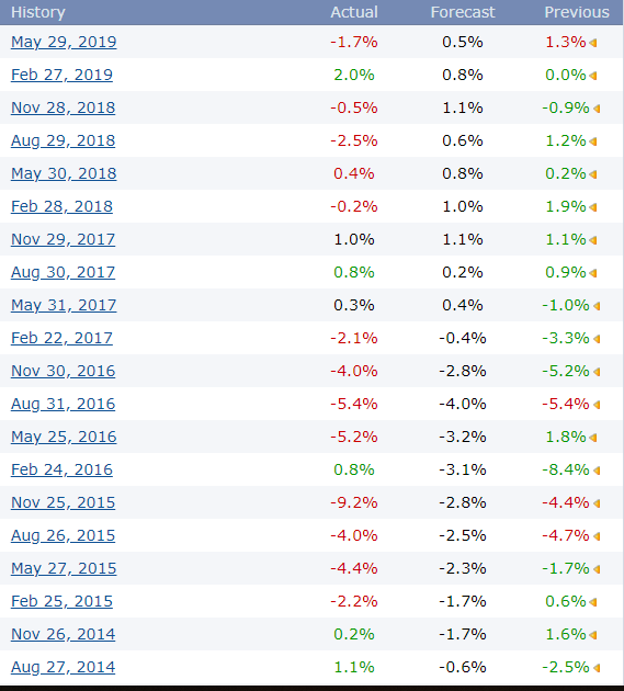
Another exciting feature of the economic calendar is the historical data on all economic releases. Let’s pick a random one, a first-tier economic data release, marked in red to highlight its importance.

This is the Private Capital Expenditure in Australia. A quarterly release shows the change in business-related capital expenditure.
Traditionally, the higher the capital expenditure, the better for the economy and, consequently, the currency. For those who don’t know, here are some examples of what fits into this category: buildings, computer equipment, furniture, and office equipment.
Logically, if the private sector expands its capital expenditure, it is a sign that it is investing in either opening new businesses or expanding current activities. This is bullish for a currency, as it suggests economic growth.
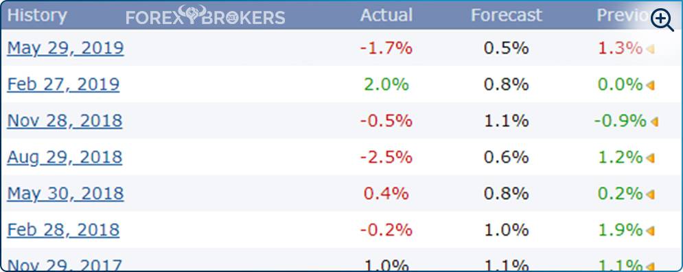
For those willing to put in a bit of effort and interpret the data for multiple quarters (or even years), the historical data on the bottom right of the image above offers a good indication. Be careful, though, and consider that all six previous releases were subsequently revised, most of them higher. To see if the trend holds and a pattern exists when reviewing the higher private capital expenditure, you can expand your research to even more releases.
Because the economic calendar offers the data, it comes as no surprise that in the last 20 quarters (five years), the private capital expenditure in Australia has been revised higher 16 times! That’s a finding you can use when interpreting how the data is calculated and how the Australian dollar will react to the initial release, as well as whether we can say anything about the pattern when revising the data.
The idea here was to point out the importance of using historical data provided by the economic calendar to discover potential trades and trade ideas. The Private Capital Expenditure example has proven this point thoroughly.
Actual vs. Forecast – The Only Data That Matters
As mentioned earlier, all economic releases have an actual and a forecast value. The forecast just gives traders an idea of what the market expects, but the actual figure is the data that really matters.
Later, in a future article in this trading academy, we’ll cover the particularities of the Non-Farm Payrolls (NFP) in the United States. You’ll see that, in that case, both the forecast and the actual matter are just for the initial reaction. If the other details don’t point in the same direction, the market will turn in the blink of an eye.
Let’s pick another first-tier economic release: this time, the GDP in Canada. Canada’s GDP shows the value of the total goods and services produced by the Canadian economy and influences the loonie (the Canadian $1 coin). In what way?
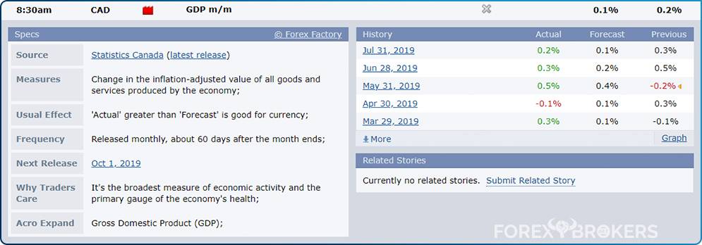
Again, the economic calendar comes in handy here. Not only does it give a quick description of the release, but it also marks it in red, highlighting its importance. Moreover, it tells traders that if the actual value is higher than the forecast value, that’s good for the currency.
Unfortunately, trading is not that easy since if it were that simple, everyone would make money, and no one would lose it. But such information does give traders a clue about where the Canadian economy will go next.
For those of you that already read the fundamental analysis article in this trading academy, you probably remember that part of trading in the currency markets is analyzing economies. Putting all the information together using the same metrics (economic indicators) ends up giving you an edge when comparing different economies. Thus, the economic calendar makes it easy to compare economies and their currencies, offering traders a competitive advantage against the market.
News Trading and Why the Markets React So Fast
One of the incentives for retail traders to join online trading is the fast market reaction to economic news. Brokers are the first ones to point out how easy it is to make a buck because the market may move a hundred pips in less than a second. If you are on the right side of the market, it’s that easy!
The problem comes from two things. First, the market “may” move. It does move sometimes, but other times it just sits in tight ranges. In the meantime, traders pay commissions, overtrade, and end up losing their patience. Second, you must be “on the right side of the market.” If not, the quick market moves will wipe out even experienced traders.
But why does the market react so fast? The answer is algorithmic trading: robots programmed to read the newswires and respond super-quick by buying or selling one currency against another in less than a fraction of a second.
All algorithms are programmed to play the “actual vs. forecast” game. If the NFP beats expectations, buy the dollar. If the NFP beats expectations by a mile, buy the dollar aggressively. If the NFP beats expectations by a mile and the previous release was revised higher as well, buy it even more. And so on.
The idea is that when all the robots buy or sell at the same time, the market reacts in a straight, vertical, rising, or falling line. That’s when the easy money is made but also lost if you end up on the wrong side of the market.
Conclusion
This article has emphasized the economic calendar and its significance for retail traders. But retail traders aren’t the only ones who use it. All financial markets players consider what the Fed is doing, what the unemployment rate is in Australia, how inflation expectations will evolve in Japan, or how the New Zealand GDP grew in the past quarter.
Knowing the release time well in advance – weeks or even months –makes it easier for traders to prioritize trades, adapt strategies, and build a proper money management system. However, in the end, no matter how well traders prepare, the market’s reaction is always unknown.
But that’s the beauty of trading in the financial markets, as no trading day is the same. While the economic calendar helps to interpret economies, there’s more to trading currencies profitably than merely interpreting the actual versus the forecast data.
