One of the earliest concepts in technical analysis, support, and resistance refers to the inability of a price to break certain levels. These levels or areas form either on the horizontal or are dynamic in nature, meaning the support or resistance follows the price on its moves to the up or downside.
The concepts of support and resistance are derived from pure price action. The idea behind technical analysis is to look at the left side of the chart for hints about what the price might do next.
Using this approach, traders studied market geometry based on price action. One of the first things they noticed were areas where the price hesitated before going through and areas where the price wasn't able to break and instead reversed.
Support and resistance sit at the heart of pattern recognition as the base for classic technical analysis patterns like double and triple tops and bottoms, head and shoulders, wedges, etc. We’ve already covered these concepts and many other ones in the same category in previous articles in this section of our trading academy.
There's a logic behind the sequence of the articles in our trading academy. First, we covered classic technical analysis patterns, and now we’re covering the concepts of support and resistance. The idea is that one of the best ways to deal with support and resistance is to look at the bigger timeframes for areas where the price might react and then go down to lower ones and search for either reversal or continuation patterns.
Between horizontal and dynamic support and resistance, the dynamic one is more powerful. This shouldn't come as a surprise because dynamic levels form during strong trend formations, and traders love to take a chance against dominant trends, looking for early entry.
The Interchangeability Principle
Despite the complicated name, the idea behind the Interchangeability Principle suggests that once broken, support becomes resistance. Similarly, once broken, resistance becomes support. Very simple.
Now, the challenge is to find out how much is too much: In other words, how many breaks are enough for an area to lose its significance? If the market breaks the support, which becomes resistance, and then breaks that resistance, which becomes support again, and so on, where does it stop?
Here comes into play another principle in technical analysis that tells us to watch out when the price tests a support or resistance level multiple times. Just like in trend trading, the ability of a price to keep testing the trendline means that, eventually, it'll break it. The same applies here: the ability of a price to keep trying at the resistance or support leads to the invalidation of the level.
The chart below shows the GBPUSD pair on the monthly timeframe. This is the most significant timeframe available for retail traders to interpret price action. The support and resistance levels in this timeframe are the strongest ones possible.
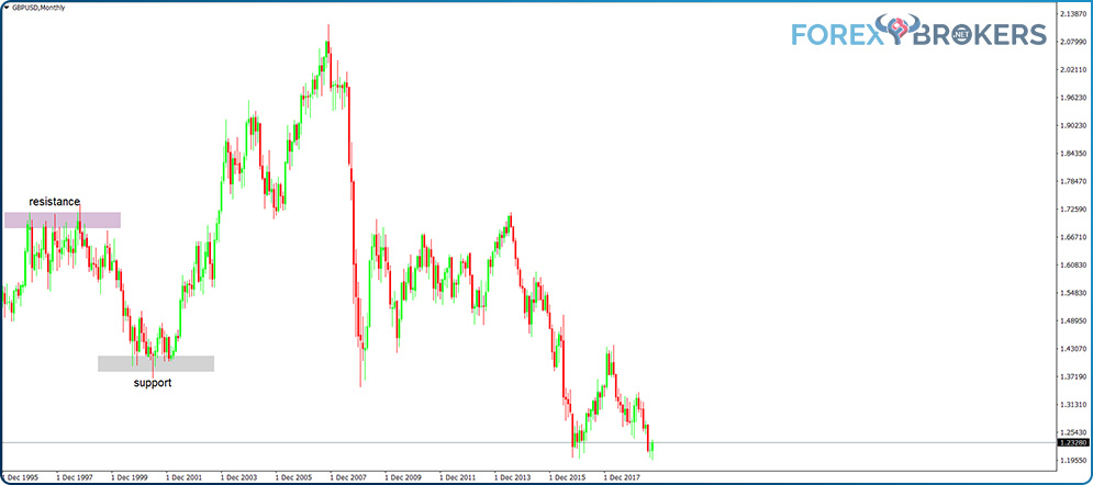
Without knowing anything on the right side of the chart, we notice that the price hesitated on the upside, meeting resistance for about two years, from 1995 to 1997. Then, suddenly, GBPUSD dropped to the 1.37 area, where it found support for about two years.
The support held, and the price bounced. In its move up, it broke the previous resistance area, and, from that moment on, the previous resistance area became support. Going forward, for the sake of making things simpler to interpret, we'll use these two colors at the same levels, changing the labels as appropriate.
Horizontal Support and Resistance
Horizontal support and resistance levels don’t disappear from the chart. Ever. But, over time, the more the price tests them, the more they lose relevance.
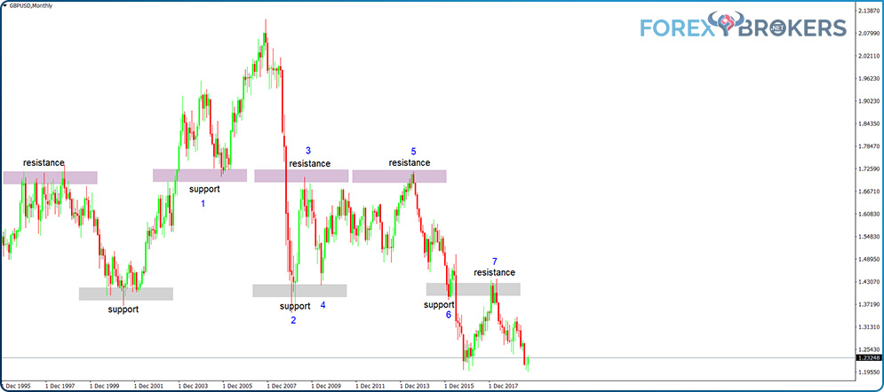
In any case, such levels or areas may prove efficient for many years. The easiest way to explain this is to interpret the GBPUSD chart, as the two areas (support and resistance) projected forward on the right side of the chart proved to be pivotal decades after they first formed.
These two areas proved efficient on no less than seven different occasions, offering a strong incentive for traders entering or exiting a trade. After all, sometimes all we need as traders is an educated guess about when and where the price might hesitate. We can use that as an indication to get out of a trade or to try contrarian trading.
Contrarian Trading with Horizontal Support and Resistance
By definition, trading support and resistance areas refer to putting into practice a contrarian view. The market has evolved into a strong trend by the time it reaches support or resistance.
If we drag the support and resistance levels to the right side of the chart, we have an idea of where the price might (note the word “might”!) react. That doesn't mean it will respond, just that it might.
On seven occasions, the two levels proved themselves. On the first one, the price broke resistance on its way to the upside, only to retest it a couple of years later. Only this time, the resistance turned into support, and the support held.
Then, suddenly, the 2008 financial crisis affected the markets. The GBPUSD pair couldn't remain unaffected, and the price broke lower. The first area of support (the one held a few years earlier) gave way, and the price shot down with no stop in sight.
However, it did stop falling as it bounced from the previous support area (nr. 2 on the chart). Following the price action on the right side of the chart reveals how support turns into resistance and vice versa.
What's even more interesting is that trading such support and resistance areas means going against the primary trend. Is it risky? Yes, it is, and trading blindly just because the price has reached support or resistance on the monthly chart isn't recommended.
Instead, traders do well by waiting for reversal patterns to form. That's right: Savvy traders first wait for the price to reach support or resistance on the bigger timeframes. Then, they look at the lower timeframes in search of reversal patterns. Then and only then does contrarian trading work.
Reversal Patterns on Lower Timeframes
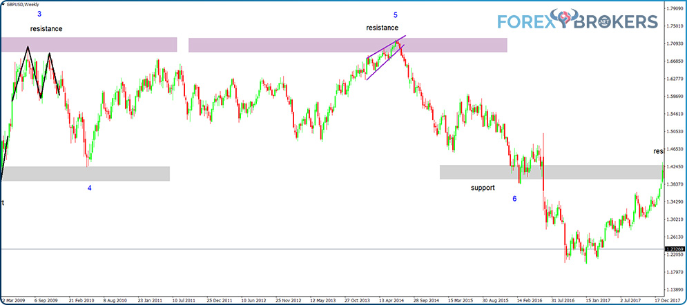
Let’s just consider the situations marked on the above chart, go on a lower timeframe, and see if we can identify reversal patterns at the horizontal support and resistance levels. If so, that’s a reinforcement of a possible contrarian trade and the focus shifts to how to trade the reversal pattern. For that, check the previous two articles in this trading academy that deal with the risk-reward ratios needed for each reversal pattern.
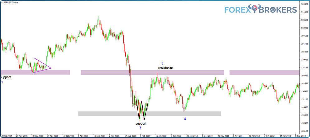
From left to right, we see the price forming a triangle right at the support area. Before the breakout, we don’t know if the triangle is acting like a continuation or a reversal pattern. Anyway, because it forms on a horizontal support, the tendency is that the triangle will reverse the trend and break higher. And so it did, breaking the upper trendline (a possible b-d trendline) and offering a great entry signal on the long side.
The price bounced but eventually returned and broke the previous support. It dove down to the next horizontal support level, where we see that it formed a double-bottom formation.
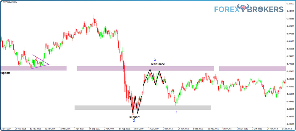
Next, the price rose for a while, meeting resistance at the previous support level. Not only did it meet stiff resistance, but it also formed a double top, a powerful reversal pattern, against it.
The fifth situation shows the price forming a rising wedge against the resistance, another powerful reversal pattern. Traders should focus here on the lower side of the wedge breaking, place a stop-loss order at the highest point in the wedge, and trade for a proper risk-reward ratio. As we mentioned in the article dedicated to wedges and other basic classic technical analysis patterns, many times, the price action that follows wedges fully retraces the entire pattern. That’s what happened in this example.
More Examples of Reversal Patterns on Support and Resistance Levels
For the fourth and sixth situations, there's no visible reversal pattern, so traders may simply ignore the support provided. In the fourth situation, the support did hold, but with no reversal pattern in sight, the risk outweighed the reward for taking a trade on the support level.
This is an important point to highlight here. Just because the market is open doesn't mean that traders must be active. Most of the time, the price action doesn't offer any new opportunities. The same goes for support and resistance levels. Trading support or resistance just because the price has reached that area doesn't mean it’s mandatory to make a trade. Disciplined traders look for clues that the area works.
Such clues are classic reversal patterns, as we have discussed already. Alternatively, when using candlestick charts, they can be Japanese candlestick reversal patterns. We'll study those later in this trading academy, but for now, the only thing that deserves mentioning is that the Japanese candlestick patterns take less time than the classic reversal ones. For instance, the hammer or the shooting star pattern only takes one candlestick to put in place a powerful reversal.
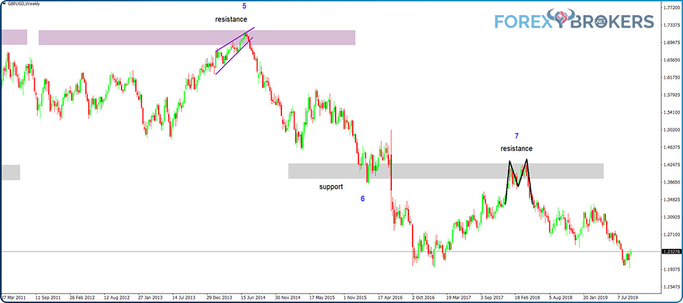
Finally, the seventh example shows a double top forming against the resistance. The previous support level becomes resistance, and the market puts in a double top. The reversal to the resistance area followed a precipitated move down due to the United Kingdom's decision to leave the European Union. In the uncertainty that followed, the GBPUSD pair almost fully retraced that move, only to be rejected by a double top against the resistance.
Dynamic Support and Resistance Levels
Support and resistance levels don't form only on the horizontal. The levels that offer support and resistance other than in a horizontal area are called dynamic, which refers to their ability to follow the price action.
The simplest way to understand dynamic support and resistance levels is to think of a trendline. Also called the line of a trend, a trendline connects two representative points on a chart. After connecting the two points, traders drag the trendline to the right side of the chart. This way, the trendline shows the possible support and resistance levels every time the price reaches it. As is the case whenever trading support and resistance, the more the price tests the trendline, the weaker the support or resistance becomes, and the price will eventually get through.
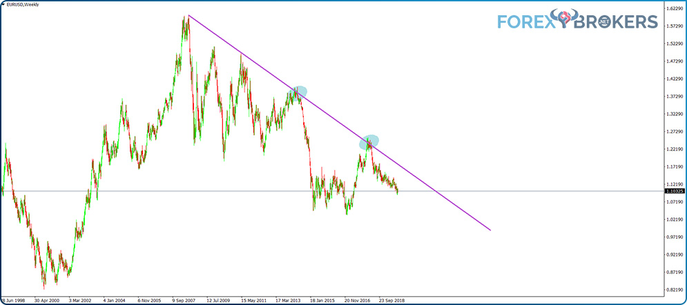
This chart once again features the monthly EURUSD pair. Later, we’ll use the same timeframe and pair to illustrate how to build a forecast based on the concepts of support and resistance. For now, let’s concentrate on the dynamic aspect of support and resistance.
We see EURUSD reversing after putting in a double top right before the 2008 financial crisis began. By connecting the top with the relevant lower high and dragging the resulting trendline further to the right side of the chart, we get the potential dynamic resistance levels.
Why is it dynamic resistance? First, the trendline follows the price. No matter how far it falls, it’ll be there unless it’s broken. Second, it offers resistance because the trendline belongs to a bearish trend. Any spike in a bearish trend meets resistance against the trend’s falling trendline.
Rising Wedge against Dynamic Resistance
The two areas highlighted on the chart shows two instances where the price met dynamic resistance against the falling trendline. In the first case, we see EURUSD forming only marginally higher highs and higher lows in a pattern resembling a rising wedge. By the time the price met the dynamic resistance, the wedge had been completed, and strong rejection followed. As is generally the case many times when trading wedges, the price action following the wedge formation retraced the entire wedge fully.
We’ve covered the rising wedge as a reversal pattern in a previous article in this trading academy. At this point, it would be great to review all the rules listed there for trading the pattern. As a quick reminder, during a rising wedge’s formation, the price action shows only marginally higher highs, and when it breaks below the 2-4 trendline, the wedge ends.
The problem with wedges and all other classic technical analysis patterns is that they take a very long time to form. When the analysis takes place on higher timeframes, the trading area is easily disrupted by day-to-day news and events, and it’s easy to forget what the initial trading plan was.
Whenever the price forms a reversal pattern against resistance, it reinforces the resistance area, making it more difficult for the price to break. When that happens, simply apply the trading rules for the reversal pattern you learned in this trading academy, and the market will take care of the rest.
Head and Shoulders against Dynamic Resistance
The second time the price meets dynamic resistance on the EURUSD chart, it forms another reversal pattern. This time, a head and shoulders pattern appears, which is more visible on the lower timeframes.
Again, following the rules of trading the head and shoulders pattern results in the trader ending up on the right side of the market. After the neckline broke lower, the price reached the measured move swiftly.
As of this writing, the EURUSD pair is trading at around 1.10, well below the dynamic resistance level. The bearish trend will remain in the plans as long as the dynamic resistance still exists.
The next time the price comes close to the dynamic resistance, traders should exercise caution. The price’s ability to keep testing the resistance level suggests weak trending conditions. Eventually, it’ll break the dynamic resistance.
So, what do you do in such a case? First, go to lower timeframes to identify reversal patterns right against the dynamic resistance. If none exist, don’t trade against the resistance. Second, even if a reversal pattern forms (e.g., rising wedge, triangle, head and shoulders, double or triple top), trade with caution: trade smaller than usual and move the stop-loss to the break-even level as soon as the price reaches the 1:1 risk-reward ratio.
We can say that after the price tests the dynamic or horizontal levels two times in a row and gets rejected, the next time it happens, traders should trade conservatively.
Confluence Areas in Technical Analysis
When two or more elements offer support or resistance in the same area, traders refer to it as a confluence area. The more diversification, the stronger the area for the price to break through. Also, the bigger the timeframe, the more difficult for the price to break through.
A confluence area can be given by two or more dynamic levels, such as two trendlines that meet at one point, each of them representing support or resistance. A confluence area can also form when the price meets both the horizontal and dynamic support or resistance.
Another look at the EURUSD monthly chart tells us that, on the move to the downside, the pair was rejected two times in a row before breaking lower decisively. Connecting the two points and dragging the resulting trendline to the right side of the chart gives us a confluence area where the two trendlines (downward and upward) meet.
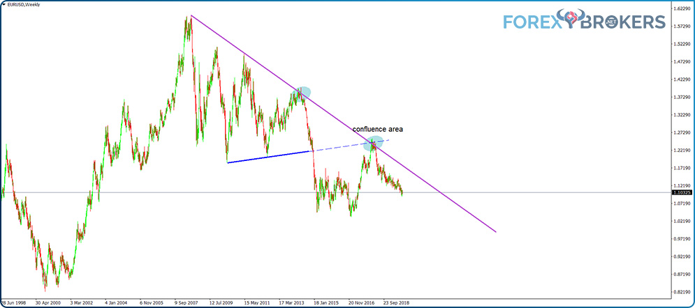
The price has a hard time clearing a confluence area, and the chart above shows how it failed in its attempt. This gives traders yet another incentive to short a pair when it meets the common area given by the two dynamic support levels.
Some people deny technical analysis and its power to forecast future prices. Such opinions typically belong to fundamental traders.
But the power of technical analysis is not to forecast future prices but rather to show levels or areas where the price might hesitate. Note the word “might.”
Traders identify such areas using technical analysis tools and then trade accordingly, placing stop-loss and take-profit orders. The higher the risk-reward ratio, the better the money management system.
Confirmation on Lower Timeframes
For traders interested in knowing more, feel free to open a EURUSD monthly chart offered by your broker and draw the two trendlines as above. Next, find the moment when EURUSD reached the confluence area and go to a lower timeframe, like the daily chart.
What you'll find is that the price forms a triangle that acts as a reversal pattern. The strong, bullish trend stalled when it met the confluence area. It took over three months of trading for the triangle to reverse the bullish trend. Therefore, traders who noticed the confluence area that EURUSD formed on the monthly timeframe had enough time to prepare to go short or, alternatively, simply wait for the triangle to break lower and trade the reversal pattern. In any case, there's no excuse to stay long with so much time to spot the strong dynamic resistance on the bigger timeframes.
Finding Confluence Areas and Projecting Horizontal and Dynamic Support and Resistance Levels
The best way to properly understand support and resistance is to practice. For this reason, the next part of this article shows you how to build a support and resistance analysis and how to project the levels farther to the right side of the chart.
The idea is that previous support and resistance levels do work for predicting where the price might hesitate in the future. Moreover, the essential levels never lose their significance, even once future prices reach them.
The approach presented next is also called “trading with a naked chart.” The name comes from the trader’s ability to interpret a chart without any trend indicators or oscillators, simply interpreting what the market did in the past and what it is most likely to do in the future.
A Historical Perspective of the EURUSD Pair
The euro came into existence around 20 years ago, when the countries of the eurozone area decided to develop a common currency. Currently, 19 countries in the eurozone share the euro.
It has a great advantage that the euro charts (especially EURUSD) display all the historical data. However, most trading platforms do not have all the data available right away. The MT4 platform solves this issue, as traders can either import the data if they have it or go to the History Center under the tools tab in the main menu. Once there, look for the currency pair you want to download the data for (EURUSD, in our case) and select the monthly timeframe. Next, click Download, and wait for the MT4 to give you everything it’s got.
For EURUSD, most MT4 platforms will provide data from the 1970s. You may wonder how that is possible, considering that the euro came into existence only about 20 years ago. The answer is that the backward projection contains the values of the previous national currencies against the USD. For instance, the Deutsche mark, French franc, Italian lira, and Spanish peso were all traded against the USD. In this way, the historical data on the EURUSD pair represents a projection of the aggregate value of all the currencies of the euro countries.
Trading with a Naked Chart – Start from the Left Side
After you download the data, the EURUSD monthly chart looks like the one below. On the left, we see the pair hesitating twice at a horizontal resistance area before the bulls manage to clear it.
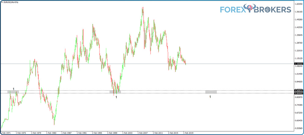
If we project that area further to the right side of the chart, we see that decades later, the EURUSD pair hesitated at the same level, only this time, the previous resistance turned into support.
Never underestimate the importance of such levels. Traders project the levels years ahead, and when the market finally reaches them, there’s no excuse for being on the wrong side of the market.
The EURUSD pair formed a triangle at the support area. This was the first time it had met the support level, so the chances were high that it would reverse. It did, as the triangle acted as a reversal pattern.
The next thing to do is to further project the level to the right side of the chart. Because the price currently sits above the horizontal support, in the eventuality, it'll reach the area again. Traders know that this is the second time it has come to this level. As already mentioned in this article, the more the price tests a level, the more likely it is that it'll break it.
Hence, on the second retest, if we see one, the ideal approach will be to check the lower timeframes for a reversal pattern. If one forms, trade it carefully. If no reversal pattern forms on the lower timeframes, chances are that the market will break the support.
Building a Confluence Area
After clearing the first resistance level, EURUSD put in a triple top in the area marked with a 2 on the left side of the chart below. Three times, it tried in vain to break higher.
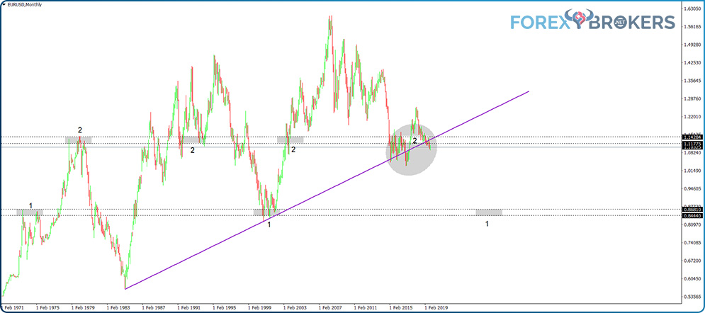
The area proved to be pivotal, as the price crossed both to the upside and the downside in the years to come. On the move lower, it made two higher lows, enough to draw a trendline and project a dynamic level on the right side of the chart.
The gray circle on the chart signals a confluence area. Both the horizontal and dynamic support meet there. The horizontal support is marked with the number 2 on the chart and is joined to form the confluence area. The dynamic support line is provided by the trendline that connects the two higher lows. It is no wonder that the price spent almost five years there and is still struggling with the area.
Projecting Dynamic Support to Find Out Dynamic Resistance
One thing to remember here is that the dynamic support level appears on the chart from the moment the higher lows become obvious, which is much earlier than when the price actually reaches the confluence area.
On the move to the upside after the second higher low, no one knew where the price would stop or even if it would stop.
To make an educated guess in such scenarios, traders project the dynamic support line to determine the dynamic resistance on the rising move. To do so, first, copy the trendline that gives the dynamic support.
Next, check the left side of the chart and project another line from the previous resistance level. If the market formed a reversal pattern, use its main price. For instance, in the case of a double top, use the second top, or in the case of a head and shoulders pattern, use the head. In the case of a rising wedge, use the top of the wedge, usually given by the highest point in the fifth segment.
In our case, we have projected the dynamic support from the third attempt up during the previous triple top formation (the first area from the left is marked with the number 2).
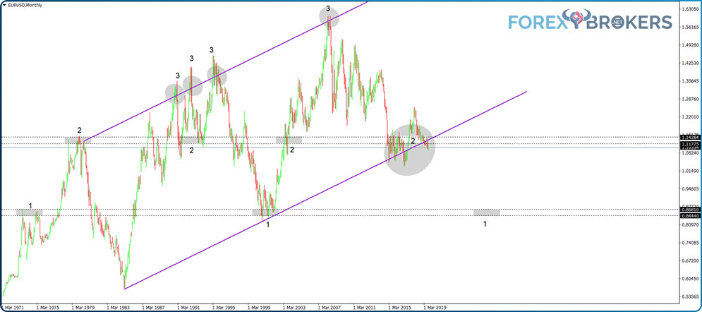
The first three circles on the projected line (marked with the number 3) didn’t form early enough for traders to benefit. After all, we only discovered the angle of the dynamic support line much later.
However, the fact that the price hesitated three times in a row serves as confirmation that the area offers strong dynamic resistance. When this level was reached for the fourth time, it strongly rejected EURUSD at its historical high of around 1.60.
Fibonacci Levels to Find Support and Resistance Areas
The next element to introduce for support and resistance analysis is the Fibonacci retracement. Previous articles have already discussed the importance of Fibonacci levels. Now, it is time to put them to good use.
To start with (and this is valid for any currency pair, especially when starting on bigger timeframes like the monthly chart here), use two horizontal lines to mark the highest and lowest points. Next, use the Fibonacci retracement to find potential support or resistance areas.
In the case of the EURUSD pair, we seek support because the market followed a bullish trend until the recent top around the 1.60 level. Naturally, the first level to mark down is the golden ratio – the 61.8% retracement.
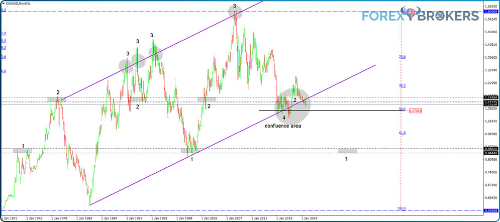
Surprisingly or not, the projection of 61.8% (the black horizontal line) is yet another element right in the middle of the confluence area. This is the third support element hitting the confluence area, and all the necessary info was available to traders from the moment EURUSD put in a double top at the 1.60 level at the start of the 2008 financial crisis.
In other words, as the price kept coming down, traders using the principles of support and resistance described here knew well in advance where the support would be down the road. As it turned out, the trading plan worked like magic.
Projecting Support and Resistance – Completing the Analysis
The last thing to do in this approach is to project the levels further to the right side of the chart. As the price of EURUSD currently sits in a confluence area, traders must be prepared to react to the next move, whether higher or lower. What are the future support or resistance levels to consider?
As we already have a rising trendline connecting the higher lows, the thing to do is to use another trendline to connect the lower highs. This way, we define the price action between the dynamic support and dynamic resistance.
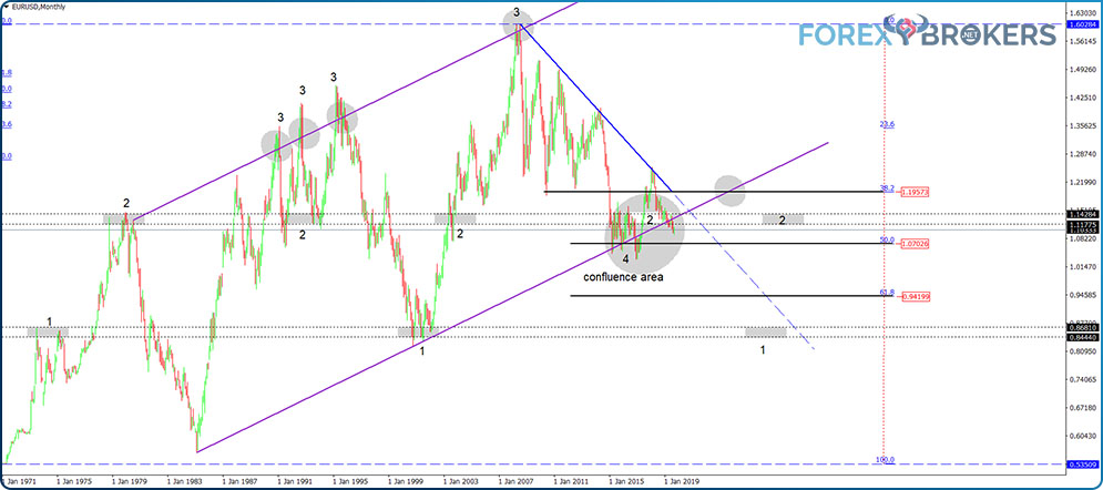
From this moment on, traders have everything they need to interpret the market. The EURUSD pair currently sits at crossroads.
Trapped between lower highs and higher lows, it has found consolidation between the 38.2% and 50% Fibonacci levels. What will happen next?
To the downside, the first level of significant support appears at the 61.8% retracement from the all-time high to the all-time low. If this support area is breached, there's nothing to support the price until the area is projected from the 1970s.
On the upside, the first hurdle to break is dynamic resistance. As indicated by the blue line that connects the lower highs, the dynamic resistance has contained the price action so far. Most likely, the EURUSD pair will have a difficult time breaking it. If it does, expect the 38.2% horizontal resistance area to play a role again.
Check out our video about Support and resistance concept:
Conclusion
Trading using support and resistance levels means interpreting the price action. Technical analysts look at the left side of the chart and gather precious information about where the price hesitated.
Using technical tools like trendlines and channels help in determining the dynamic aspect of resistance and support. Between dynamic and horizontal support and resistance levels, the dynamic ones are more powerful.
The two types of support and resistance are cornerstone concepts in technical analysis. Further study of classic technical analysis reveals the continued use of these two concepts in theories like the Elliott Wave Theory (channeling with complex corrections) or Andrew’s Pitchfork (dynamic levels derived from pivot points).
Therefore, it comes as no surprise that the concepts of support and resistance are presented in the Newcomer section of our academy as one of the pillars of technical analysis. As you are accustomed to by now, we used plenty of practical examples to illustrate the application of the two concepts and their use when trading in the currency market.
As the last article from the Newcomer section dedicated to technical analysis, this article wraps up the introductory part of the beautiful discipline of interpreting past prices to project future ones. The last four articles in this section deal with specific fundamental aspects from various parts of the world with a material impact on almost all currency pairs of the Forex dashboard.
