LISTEN TO THIS ARTICLE:
Oscillators in Forex are technical indicators plotted at the bottom of a chart in a small, separate window. Traders use them to spot market reversals and possible false moves made by price.
The beauty of oscillators is that they are all based on a formula applied to historical data. For this reason, traders rely on an oscillator chart more than on the actual price action on the main chart.
In technical analysis, there are more oscillators than trend indicators. The MetaTrader4 platform offers plenty of them with the default settings, making it easy for the trader to test many of them and pick the one that best fits trading expectations.
While not every oscillator has an overbought and oversold area, most of them do. However, currency traders should keep in mind that popular oscillators such as the ones presented in this article have a long history. Built to serve traders of other markets (stocks, commodities, etc.), they have different outcomes on the Forex (FX) market.
In this article, we will introduce the essential oscillators in technical analysis and how to trade the currency market with them. Also, we will cover both the classic approach (i.e., trading overbought and oversold areas) and divergences with oscillators.
The basic theme of this article is that an oscillator follows the price. When the price falls or rises, the oscillator follows, albeit not always traveling the same distance as the price does. This is a divergence and is one of the ways to profit from the use of oscillators.
Oscillators show trending conditions too. For instance, when traveling from overbought to oversold or oversold to overbought on bigger time frames, an oscillator forms small trends on lower ones.
Trading with Oscillators
The previous article, part of this trading academy, showed how traders could use oscillators to ride trends too. In this article, the focus shifts on how to interpret oscillators the standard way, without discussing a vital concept to be treated in a separate section—divergences with oscillators.
As this is the only article dedicated to the standard interpretation of oscillators, we will cover the most relevant ones. However, keep in mind that this is an area of continuous improvement. Every year, traders from all over the world add new oscillators as the search for the perfect indicator continues.
The ones presented here have stood the test of time and have proven their strength in all types of markets—equities, commodities, and now currencies.
Most trading platforms project oscillators at the bottom of the main chart in a separate window. Typically all of them have some predefined levels showing overbought or oversold market conditions.
Some travel only in positive territory; others have both positive and negative values. In some cases, the oscillator does not have predefined levels—it is the trader’s job to find them based on each currency pair’s characteristics.
The main purpose of an oscillator is to help the trader filter potential false moves by the price. Like any technical indicator, the oscillator considers multiple periods before plotting a value. For this reason, the unwritten law when trading with oscillators is to follow its movements rather than those of the price.
All oscillators presented in this article use the default settings. These are the settings the developers had in mind when building them, so we do not alter them. However, the curious trader may play with the values by merely editing the indicators in search of a better strategy. If that is the case, keep one thing in mind: the more periods the oscillator considers, the flatter it will become.
Relative Strength Index (RSI)
Favored by both retail and professional traders, the RSI helps identify certain market conditions. Developed originally for the commodity and stock markets, it quickly became part of all modern online trading platforms.
Nowadays, we can say there is no trader using technical analysis who does not know what the RSI stands for and did not use it at least once in their trading career. Its popularity made it one of the most famous trading indicators, and, in some cases, traders use it as a trend indicator too.
Developed by J. Welles Wilder some 50 years ago (shortly after most of the important currencies in the world began to free-float), it works on every market and every trading environment. It appears at the bottom of the chart and always has a positive value—between 0 and 100.
J. Welles Wilder built the RSI indicator to consider 14 periods. This means that the current value plotted by the RSI interprets the previous 14 periods before calculating the present RSI value. However, the MT4 trading platform allows traders to change the number of periods, but that would also change the way the RSI appears. Therefore, the RSI’s original interpretation, as designed by J. Welles Wilder, is altered if the number of periods considered is different from 14.
If the trader chooses to change the number of periods in the RSI calculation, the oscillator’s line changes too. The more periods the RSI considers, the flatter its line. Conversely, the fewer the periods, the more swings the RSI makes.
The idea is that by changing the periods considered, the standard interpretation of the RSI changes too. However, playing with the number of considered periods is not a bad thing; it may lead to a custom-built strategy that uses the RSI as an additional confirmation for a different technical signal.
The RSI’s purpose is to show extreme levels. For this reason, the default setting shows two levels of great importance to traders: the 70 and 30 levels.
The standard interpretation is that every time the RSI reaches values beyond 70, the market is overbought. When it dives below 30, the market is oversold.
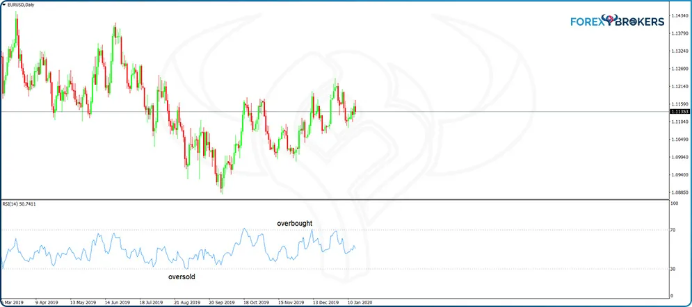
It is hard to assign percentages to the time the RSI spends in overbought or oversold territories, but let us just say that most of the time it spends between the 70 and 30 levels. When exceeding the levels, the more it moves above 70, the more bearish the market gets. The more it dips below 30, the more bullish the market.
As always, there is a catch. Some of the strongest trends in any market form in overbought or oversold territories. This means that traders would make a mistake just to buy RSI values below 30 or sell when above 70. If that were the correct call every time, all trades would end up in profit, and all traders would become at least millionaires. We know by now that is not the case, and the explanation is that trading overbought and oversold levels works well in ranging markets while failing terribly in trending ones.
A rule of thumb is that the stronger the trend, the more time the market spends in overbought or oversold territories. Therefore, the key to trading overbought and oversold territories is to identify if the market is going to move sideways properly. If it is trending, selling overbought or buying oversold levels will simply not work.
Momentum
A very powerful oscillator, Momentum differs from the regular oscillators that show overbought and oversold levels. Often misunderstood by traders because of this fact, Momentum is not on the top of the list when retail traders choose an oscillator to back their trading decisions.
It reflects the pure price action of any market, and for this reason, the info provided by the Momentum oscillator is essential. At first sight, the oscillator seems to plot a line on a small window without any meaning.
The standard number for the periods considered by the Momentum indicator is 14 as is the case for many other oscillators. Also, the usual caveat applies here too—the bigger the number of periods considered, the flatter the Momentum line.
As an oscillator, Momentum travels only in positive territory. The key to understanding it is to consider that by reflecting the price action, it reflects the market’s volatility too.
Low-volatility markets have the Momentum line almost flat. However, in a high-volatility market environment, the Momentum oscillator reflects that volatility in a precise way, giving traders room for speculation.
Like most oscillators, the Momentum oscillator closely follows the price action. It means that when the market drops, Momentum usually drops as well, and when the price rises, the Momentum oscillator shows a similar move. Sometimes, though, Momentum fails to do what the price does; in other words, it diverges from the price move. We will treat bullish and bearish divergences with the Momentum oscillator in a separate article here on this trading academy.
One way to trade with the Momentum oscillator is to use its midpoint as an equilibrium stance. That would be the 100 level.
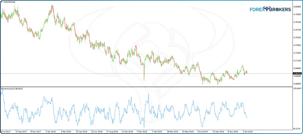
Therefore, the first thing to do is to edit the indicator in such a way that the small window at the bottom of the screen shows the 100 level. Just right-click anywhere on the chart, and from the indicators list, choose to edit the Momentum indicator. Add the 100 level and customize it in terms of color and thickness, and the window now looks like below.
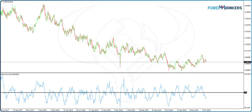
This is the AUDUSD daily time frame, and the horizontal black line marks the 100 level on the Momentum oscillator. We notice the Momentum oscillating above and below the 100 level as the currency pair moves either to the upside or to the downside.
A quick comparison of the price action and the Momentum’s swings reveals that the oscillator moves away from the 100 level every time the AUDUSD pair traveled. Moreover, the moment volatility declines and consolidation begins, the Momentum oscillator comes back to the 100 mark.
While this oscillator does not have built-in overbought and oversold levels, we can edit it in such a way to reflect historically overbought areas. For example, any move beyond 104 may be overbought, and a move below 96 oversold.
Remember that potential levels differ from currency pair to currency pair because the Momentum indicator closely follows market volatility. For instance, more volatile pairs such as the GBP–JPY see the Momentum oscillator traveling well beyond the 104 and 96 levels. Therefore, a suitable overbought and oversold strategy with the Momentum oscillator requires an analysis of historical levels to find out appropriate overbought and oversold areas.
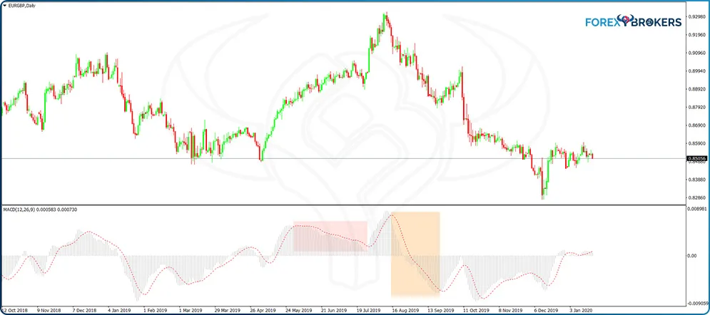
MACD
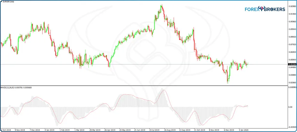
The moving average divergence convergence (MACD) is a popular oscillator among retail traders. It has an exciting particularity—despite being listed on the MT4 platform as an oscillator, the MACD is just a representation of different trend indicators (i.e., moving averages) on a small, separate window.
Based on three different moving averages (two exponential moving averages (EMAs) and one simple moving average (SMA)), the MACD considers historical data before plotting its values. As such, it has two EMAs (one fast, one slow) that consider the historical data on the previous 12 and 26 periods, respectively. In addition, it shows an SMA that considers the last nine periods. Applied on a chart, it appears as follows:
A previous article in this trading academy illustrated how the MACD oscillator also works as a trend indicator. As an oscillator, the MACD has different interpretations, such as illustrating overbought and oversold areas or forming bullish or bearish divergences when compared to the actual price.
While we will discuss divergences some other time, the way to find overbought and oversold levels resembles the methodology used in the case of the Momentum indicator. Simply check historical data on the MACD for each currency pair and time frame interested to trade and edit the oscillator in such a way to show those levels for future interpretation.
The MACD plots both positive and negative values. On the small window at the bottom of the main chart, the MACD shows two elements: a histogram and an SMA.
The histogram (the gray lines in the picture below) shows the cross of the two EMAs mentioned earlier in the article. When the faster EMA crosses above the slower one, the histogram turns positive (i.e., the gray bars rise above the zero level). Conversely, when the fast EMA moves below the slow one, the MACD shows a negative histogram.
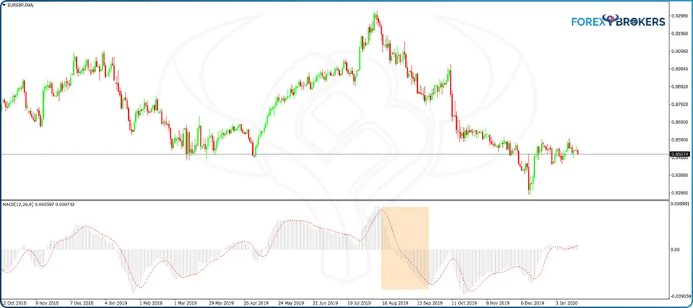
The red line is the SMA, and the ideal trade with the MACD is to stay short as long as the histogram declines and the bars remain below the SMA or to stay long while the histogram rises and the bars form above the SMA.
A conservative approach means that traders wait first for the MACD histogram to turn negative before going short or positive before going long. The same EUR–GBP chart offers a perfect example as to why it is wise to wait for the MACD histogram to change sign before taking a trade (the pink rectangle shows a declining but still positive histogram while the price keeps rising).
Awesome Oscillator
Another market momentum indicator, the Awesome oscillator, calculates the difference between two SMAs—the 34- and 5-period SMAs. However, there is a catch: Unlike most other indicators, the Awesome oscillator does not use the closing prices of each period; instead, it uses the midpoint of each bar or candlestick to avoid false breakouts as much as possible.
The Awesome oscillator has either positive or negative values depending on what the moving averages do. When the fastest-moving average is trending higher than the slow one, the Awesome oscillator plots positive vertical bars. When the opposite happens, the bars have a negative value.
Also, the colors used by the Awesome oscillator are meant to show trending conditions. For instance, when the oscillator plots only red bars, it means that each bar is smaller than the previous one, showing bearish conditions. But when the bars turn color and start having bigger values, the Awesome oscillator shows trending conditions.
The standard way to trade with the Awesome oscillator is to use the zero level as a bullish or bearish signal. On declining red bars, the moment the values turn negative, that is a sell signal. Conversely, on rising bars, the moment the values turn positive, that is a buy signal.
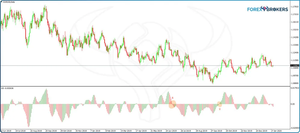
As the chart above shows, that works on clear, steady trends. But when the market is choppy, it is difficult to trade all the entries given by the Awesome indicator.
For this reason, savvy traders combine the Awesome indicator with the rules of a trend. A bearish trend is made of a series of lower lows and lower highs. Therefore, if bearish trending conditions persist, traders avoid the bullish signals offered by the Awesome oscillator and trade only the bearish ones. Alternatively, on a bullish trend characterized by the market constantly making higher highs and higher lows, traders ignore the bearish crosses given by the Awesome oscillator and use only the bullish ones for adding to the long side.
A powerful setup to use with the Awesome oscillator, the Twin Peaks, resembles a divergence, but it does not have anything to do with the actual price. The focus sits only with the oscillator and the shape of its diagram.
For a bullish Twin Peaks setup, wait for the Awesome oscillator bars to decline below the zero level. Next, the oscillator begins forming green bars, but they fail to plot positive values. Shortly after, the oscillator plots red bars again, but the biggest one fails to extend beyond the red bar of the previous peak. Moreover, the distance between the two peaks should be as small as possible.
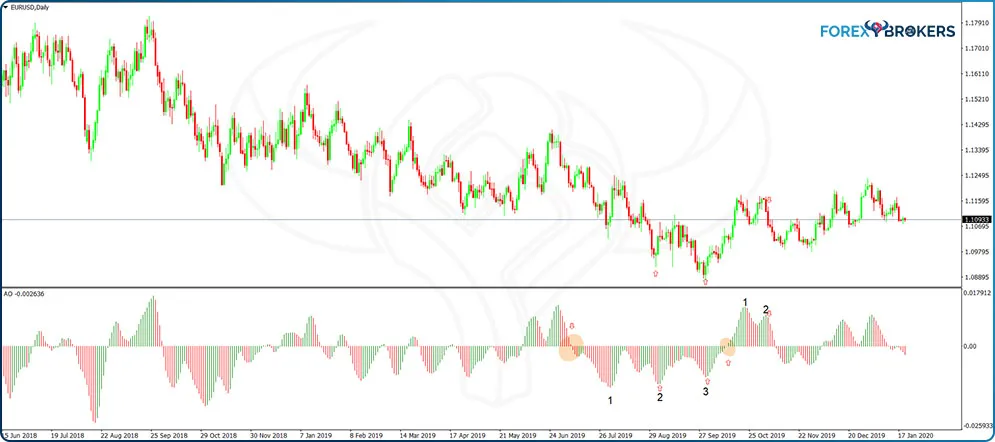
In the above chart, from left to right, the numbers 1, 2, and 3 show two bullish Twin Peaks setups. The first entry happens on the first green candlestick after the second peak. Next, the second entry appears on the first green candlestick after the third peak.
There is also a bearish Twin Peaks setup following right after. The Awesome oscillator plots green bars; they turn positive as the market rises. Next, the oscillator starts plotting red bars, but without them crossing the zero level. The following green bars in the second peak do not extend beyond the previous peak’s high, and the oscillator puts a new red bar. That is a bearish Twin Peak setup, indicating a potential move lower.
Commodity Channel Index
Introduced by Donald Lambert in the 1980s, the Commodity Channel Index (CCI) grew in popularity among traders of all financial markets. As the name suggests, it was first tested and used on the commodity markets at a time when the currency market was in its incipient phases.
The CCI considers the statistical mean of a security and calculates the deviation from it. It considers the price of a security (or currency pair) and the simple moving average (SMA). Moreover, the CCI divides the difference between the two by the mean absolute deviation of the typical price.
As an oscillator, the CCI appears on a small window below the main chart and travels both in positive and negative territory. The +100 and -100 levels are viewed by traders as overbought and oversold levels, areas where to close long or short trades or to begin trading in the opposite direction.
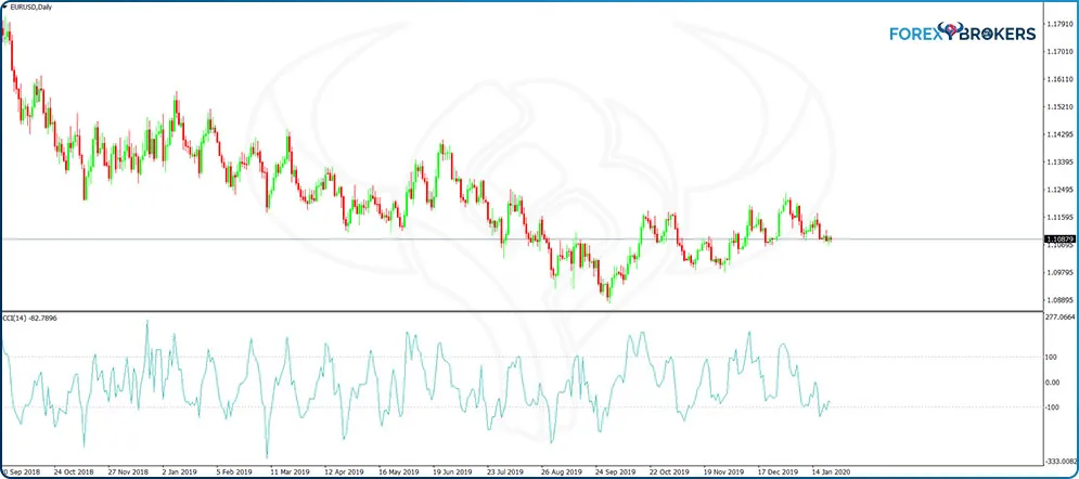
But the CCI was not built for the currency market initially, and the higher the market’s volatility, the easiest for the CCI to reach overbought and oversold levels. Unless it is a choppy market, like the recent EURUSD price action on the daily chart, the CCI stays overbought and oversold for long periods, not to mention that it exceeds the +100 or -100 levels easily.
To start, the standard interpretation of selling overbought and buying oversold works well in ranging markets. If you expect ranges to dominate a currency pair (e.g., the EURUSD during NFP week typically moves in ranges, and trading overbought and oversold levels works most of the time).
For this, traders go down on the lower time frames like the hourly or maximum 4h chart and sell when the CCI closes for the first time above the +100 level or buy for the first time when the CCI extends beyond the -100 one.
On bigger time frames like the daily one, even in choppy markets, the CCI gives different entries. Most of the time, the market reacts shortly after the CCI reaches overbought or oversold levels, but this is not always the case. For practice purposes, consider the EURUSD chart above and the examples marked and see the slippage given by each entry.
To get rid of potential false signals given by the overbought and oversold levels, one way is to edit the CCI so that it filters most of the signals. The outcome is a reduced number of trades but more accurate entries.
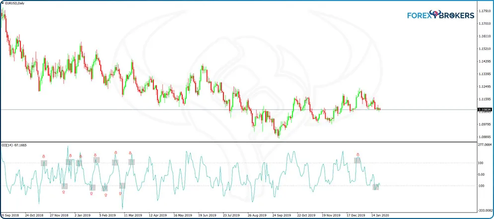
- Extending the Overbought and Oversold Levels with the CCI
Using this strategy implies editing the CCI indicator. To do this, right-click anywhere on the chart, select the CCI indicator, choose the Edit tab, and then use the option available to Add levels. By adding +250 and -250 we have extended the overbought and oversold levels to be used as entries for trades in the opposite direction while the exit for each trade remains the opposite 100 level.
If we apply these changes to the same EURUSD daily time frame, the number of trades decreased significantly. Only three trades appear to respect the rules listed earlier, but all of them were winners.
From left to right, the first trade appears when the CCI reaches -250. Keep in mind that the entry and exit for each trade should take place at the close of the period—in this case, at the close of the daily candlestick. The market then rebounds, and when it closes above the +100 level for the first time, that is the exit from the long trade.
Following the same rules, the next two trades ended up almost picking tops and bottoms. In the end, all three trades showed a profit.
Before being disappointed by the small number of trades in such a big time frame, keep in mind that this approach can be applied on all currency pairs and all time frames. In other words, it is guaranteed that at any one time, there is at least one trade to take by following the extended overbought and oversold levels with the RSI.
DeMarker
Developed by Tom DeMark, the DeMarker indicator is a free oscillator part of any trading platform. It resembles the RSI in the sense that it has overbought and oversold levels and travels only in positive territory.
However, there is a difference between the two. Unlike the RSI, the DeMarker range is between 0 and 1, not between 0 and 100 as in the case of the RSI. Moreover, it tends to reach overbought and oversold levels quicker than the RSI does.
For this reason, some traders plot the two oscillators on the same chart and look for differences between the two. Because the DeMarker reacts faster to price changes, it acts as a signal line to enter or exit a trade.
The standard way to trade with this oscillator is, once again, by using its overbought and oversold levels. Anything above 0.7 represents overbought levels, while all the values below 0.3 are an opportunity to go on the long side, buying oversold prices.
However, the DeMarker oscillator may remain in extreme territory for quite some time before reversing. For this reason, it is not wise to simply sell overbought or buy oversold, as the trader remains captive in a countertrade. The thing to do is to wait for a confirmation from the DeMarker oscillator, that is, wait for the DeMarker line to move back below 0.7 or above 0.3 before going short or long, respectively. As always, when it comes to oscillators, wait for the close of the period before getting into a trade.
Even this safeguard measure does not guarantee winning trades. But if the trade reverses, and the DeMarker reverses too, the natural thing to do is to reverse the trade to cover the initial loss—and make some extra.
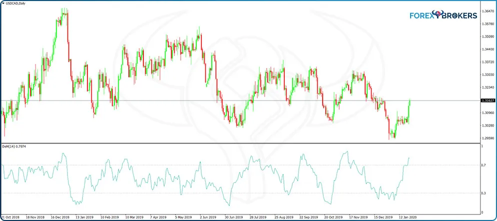
Let us take the first trade from left to right on the USDCAD daily chart above. The DeMarker oscillator reaches the overbought area, but the price continues to rise for a while. The big red candlestick marks the crossing of the DeMarker below 0.7, a signal to go short until the oscillator reaches oversold levels.
The second example is about a bullish trade that got reversed. The price reversed and stretched beyond the lows of the entry candlestick—a sign to reverse the trade because the price most likely makes a new low and creates a divergence with the DeMarker oscillator.
Stochastics
The Stochastics oscillator also has overbought and oversold levels. It travels only in positive territory, and values above 80 are overbought and below 20 oversold. The difference between Stochastics and other oscillators, such as DeMarker or RSI, is that it reaches the extreme levels much faster.
Because of this, many traders prefer to use a different oscillator when trading overbought and oversold areas (i.e., when they suspect the market will range for a while).
Speaking of ranges, the tendency is to think of small ranges on lower time frames and use oscillators to scalp for quick profits. But ranges do form on bigger time frames as well. In fact, the most rewarding ones appear on the bigger time frames, as the following example shows.
The Stochastics oscillator has an advantage when compared with other indicators in the sense that it has two lines, and one of them acts as a signal line. The red line is the signal line, and when it crosses above the blue line, in the overbought territory, it forms a bearish signal. A bullish signal appears when the red line moves below the blue one and in the oversold territory (i.e., below 20).
As always, there is a catch. Because not all signals generated by the Stochastics oscillator end up with a profit, a trader’s job is to filter them in such a way that increases the win/lose ratio. One way to achieve this is to ignore the signals that appear after the Stochastics oscillator formed multiple crosses on its way to the overbought or oversold areas.
Relative Vigor Index
The Relative Vigor Index (RVI) also has a signal line. Just like Stochastics, when the signal line moves below the main one, it shows bearish conditions. Conversely, when it moves back above, the market turns bullish.
The difference between Stochastics and the RVI is that the RVI does not show overbought and oversold levels. Instead, the indicator oscillates above or below the zero level, just like the MACD does or in a similar fashion with how the Momentum crosses the 100 level.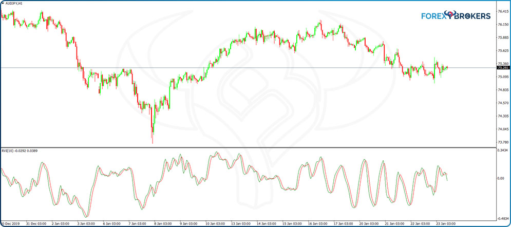
The first thing to do is to edit the RVI indicator and add the zero level. The RVI works best as a continuation indicator, despite the fact that it falls into the oscillators’ category.
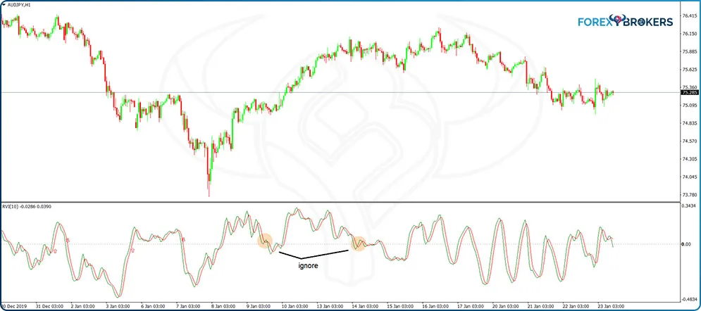
Next, buy or sell when the RVI crosses above or below the zero level, respectively. Tip: ignore the signals that appear after choppy RVI and trade only when the RVI crosses the zero level in a straight line.
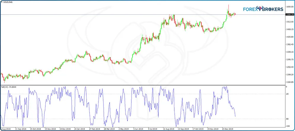
Williams Percentage Range
If the Stochastics oscillator reaches overbought and oversold areas quicker than other oscillators, the one that does it even faster is the William’s Percentage Range. For the simplicity of this writing, we will just call it the Williams oscillator.
This oscillator moves only in negative territory. More precisely, its maximum value is zero, and the minimum -100. The standard overbought and oversold levels are -20 and -80, respectively, but there is no way one can trade overbought and oversold levels with the Williams oscillator simply because it reaches them extremely easily; thus, the signals are not of any value, that is, unless traders combine the signals given by the Williams oscillator with a trend indicator.
A strategy to consider combines the Williams oscillator info with trending conditions. Below is the gold daily chart showing the recent bullish price action on the yellow metal. It forms a series of higher highs and higher lows, specific to a rising market, in a bullish trend that started in the middle of 2018.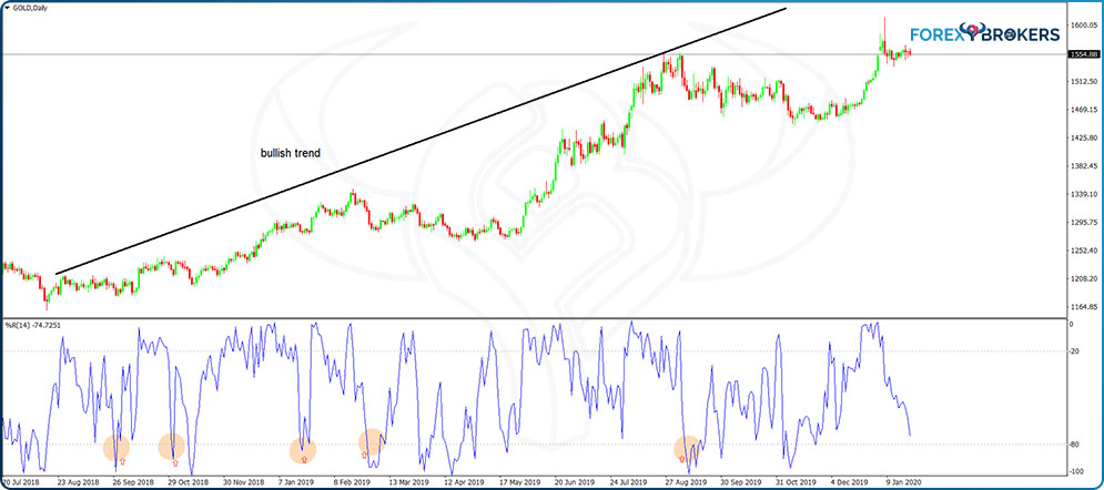
The idea behind this strategy is to add to a long trade every time the Williams oscillator reaches the oversold area and as long as the series of higher highs and higher lows remains in place. However, use entries only for the times when the Williams oscillator reaches the oversold area after coming down from the overbought one.
Conclusion
There is an oscillator for every market, and the ones presented here have different characteristics. Some reach overbought or oversold levels quicker than others, some travel only in positive territory while others in negative, and others oscillate against a pivotal level (zero, 100, etc.).
But they all have one thing in common—besides most of them showing overbought and oversold conditions, they follow the price to some extent, and when they do not, they form bullish or bearish divergences, a concept we will discuss in a future article here on this trading academy.