LISTEN TO THIS ARTICLE:
A Moving Average (MA) follows the price and provides valuable information to the technical trader. It looks like the simplest form for building a technical analysis indicator – but MAs have proved their value time and again.
It considers historical prices before plotting a value below or above the current market price. The more historical data considered, the flatter the MA becomes, and the trading platform plots it further from the price.
In traders’ jargon, faster or slower MA refers to the number of periods considered before computing the MA value. A faster MA turns quicker with the price – it reacts to market changes faster because it considers fewer periods than slower MAs do. A slower MA analyzes data from more periods and doesn’t turn with every market swing.
It may be that MAs were the first form of technical analysis. Multiple types of MAs exist today based on different variables considered, but the basic idea of an MA is to offer a clear view of the market.
An MA splits the chart into two parts – a bullish one and a bearish one. The standard interpretation is that when the price is above the MA, it shows bullish conditions – traders expect the market to rise, look to buy market dips, and go long. Bearish market conditions form when the price falls below the MA – traders don’t want to buy anymore, go short on spikes, and ride the potential bearish trend.
MAs offer a simplistic yet efficient market interpretation. By simply dividing the chart into bullish and bearish conditions, MAs keep the trader focused on the main trend.
This article looks at all aspects of trading the markets using MAs, including their pros and cons, and also covers some trading strategies. The aim is to uncover everything there is to know about MAs and present them in such a way that everyone understands their usefulness.
Moving Average – Important Indicator in Forex Trading
As a trend indicator, the MA in Forex has similar issues to any other indicator of its kind – it lags the price action. Furthermore, it becomes difficult to understand and use when the market consolidates in tight ranges.
Trend indicators work well in a trending environment. But even the currency market, known for its elevated volatility levels, doesn’t trend that much. In fact, the price action on any currency pair consolidates in ranges more than it moves in bullish or bearish trends.
For this reason, before using any trend indicator, traders must find out if the market is going to trend or sit in a range. Oscillators work best in ranging markets, while trend indicators outperform in trending ones.
Another issue with trend indicators is that they require patience and discipline. Because strong trends do not form that often, traders should ride them all the way – few manage to hold onto a winning position for a long time. In other words, the performance of a trend indicator is undermined by the trader’s ability to ride the trend.
MAs use different prices, depending on how the trader wants to compile the data. Most common MAs in Forex use the closing price of each period, but other possibilities exist too – the opening price, the high, the low, or a combination of them.
In ranging markets MAs give conflicting signals. For a trader, an important aspect is to define conditions for ranging and trending markets. Next, wait for the trend to start before entering a trade. Finally, ride the trend as long as possible, paying attention to possible trend reversal price formations.
Different Types of Moving Averages
Depending on the methodology used, different types of MAs exist. The MetaTrader4 platform lets traders select how to compile the average.
Under the Insert tab on the platform, look for the Indicators tab. Next, under the Trend category, select Moving Average. The following pop-up window appears:
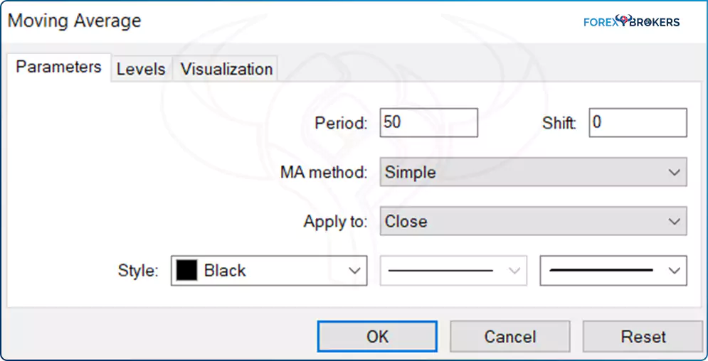
Every parameter of an MA is customizable. The Period tab shows the number of periods considered by the MA – in this case, 50 periods, a common MA used by many traders.
The MA method refers to the type of the MA – the default type is the Simple Moving Average (SMA), but other types exist as well, like the Exponential Moving Average (EMA), the Smoothed Moving Average (SMMA) or the Linear Weighted Moving Average (LWMA).
Bear in mind that, more or less, they show pretty much the same thing. For instance, the difference between an SMA and an EMA is so small that you would barely notice. It is said that the EMA, indeed, stays closer to the price, reducing the lag when reacting to the price action. But if the market is not in a trending mode, the moving averages tend to fail, no matter their type. The MetaTrader4 platform lets you customize how to apply the moving average as well – to the closing or the opening price of a period, or even to the midpoint (the average between the high and low of a period).
Simple Moving Average (SMA)
Also called the arithmetical moving average, the SMA divides the sum of prices over a specific period by the number of periods. For example, SMA(20) considers the last twenty periods, sums the prices (usually the closing prices), and then divides the outcome by 20.
The SMA is the simplest moving average, yet an effective one. When applied on a chart, it offers indications regarding the current state of the market – bullish or bearish.
The usual caveat applies – the bigger the number of periods considered, the more relevant the interpretation. This means that if the price breaks below or above the SMA(200), it has more powerful implications on the overall market than a similar move below or above the SMA(20).
As a trend indicator, an SMA appears on the main chart. The chart above shows the SMA(50) on the EURJPY daily timeframe, applied on the closing price. It shows the average closing price for the last 50 days on the EURJPY pair. At that point in time, the ability of the price to break above the SMA(50) is a bullish sign, and the moving average now serves as support.
Exponential Moving Average (EMA)
When compared with an SMA, the EMA adds a specific share of the current price to the previous closing price of the moving average. For this reason, the latest closing price is more important for the EMA. The EMA gets closer to the current price because the closing price of the most recent candlesticks weighs more.
The blue line on the chart above is the EMA(50). Applied on the same EURJPY daily timeframe, it shows the difference from an SMA calculated on a similar period. The EMA tends to react quickly to changes in market direction, and for this reason, it is preferred by traders when using indicators like the Bollinger Bands. Often, the Middle Bollinger Band (MBB) is set as an EMA rather than an SMA, for the simple reason that it turns faster when the price changes direction.
Smoothed Moving Average (SMMA)
SMMA is a combination of an SMA and an EMA. The formula to calculate the SMMA values is a bit more complicated than in the previous two instances. What is important to remember is that an SMMA has equal weights attributed to current and historical prices. Because of that, many technical traders consider it the true illustration of a moving average.

The SMMA’s characteristics become obvious by looking at it on the same chart with the SMA and EMA and using the same period to compile it. Because it attributes equal weights to current and historical prices, it acts more like a moving average that uses more periods (i.e., it is slower than the SMA and EMA that use the same number of periods).
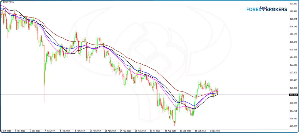
Linear Weighted Moving Average (LWMA)
Another popular moving average that many traders consider to be the most accurate, the LWMA puts an emphasis on the current prices. As such, it uses bigger weights for the current price, and the weight decreases with each previous period. Moreover, it does so in a linear fashion, hence its name.
The weight coefficient, therefore, has a primordial role when calculating the LWMA. When compared with the other types of moving averages explained in this article, the LWMA reacts the fastest in similar conditions. The magenta line on the chart below reveals the ability of the LWMA to quickly react to changes in price, illustrating the increased weights for the prices closer to the current one.
How to Use Moving Averages when Trading
Moving averages are the source of many trading strategies, both manual and automatic. Used as an individual indicator or in combination with some other ones, a moving average always helps to understand the basic characteristics of a market.
Trend traders want to see the price remaining above or below the moving average for sustained periods. If it does that, it means that the market is trending, and using a trend trading strategy makes sense.
Range traders, on the other hand, want to see the price frequently crossing the moving average. This means that ranges dominate the price action, and the right trading strategy involves using oscillators to trade overbought and oversold areas.
No matter the strategy and the view of the market, a moving average offers a quick interpretation of current market conditions. As a rule of thumb, trading strategies that incorporate a moving average perform better than those using solely one moving average due to the lagging characteristic of the moving average.
Traders have different preferences regarding the type of moving average and the periods used. Some prefer SMAs, some other EMAs, and so on. Moreover, some traders see value in using prices other than the closing prices of a period. Depending on the strategy, moving averages have enough features to customize them so that they fit every type of trading style.
All the examples that follow use the SMA. However, for all the other types of moving averages, the strategies and the market interpretation are similar, except that the entry and exit levels may differ due to the moving average characteristics.
Support and Resistance with Moving Averages
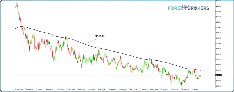
One of the simplest ways to interpret moving averages is to use them as support or resistance levels. To make the most of an MA when trading support and resistance levels, make sure to consider as many periods as possible. The standard number of periods for the slowest moving average is 200 – any number bigger than 200 flattens the moving average to such an extent that it becomes a horizontal line, and interpreting its levels no longer makes sense.
For this reason, the MA(200) is considered the mother of all MAs, meaning it is the MA that incorporates the most periods in its calculation. Also, the bigger the timeframes the MA(200) is applied on, the stronger the support and resistance levels offered.
Before looking at some examples, there’s one thing to consider. The volatility on the currency market reaches elevated levels many times, so the resistance or support levels offered by a moving average should not be interpreted as exact levels, but more like areas of support or resistance. Sometimes, the price gets rejected straight away from the moving average, but other times it gives the impression that it broke the moving average, only to reverse sharply.
One way to resolve this issue is to use percentages to calculate the breakout distance. For instance, on a break that doesn’t exceed a certain percentage of the previous swing’s length, traders might disregard the break — more on that in the examples that follow.
The black line on the EURUSD chart below represents the MA(200). Because this is the daily timeframe, it provides important support and resistance every time the price reaches it.

There are six different instances, each marked on the chart with the corresponding number, showing how to interpret the price action surrounding the moving average. As a rule, the ability of a price to revisit the MA signals a trend’s weakness.
This means that for the trend trader, the price should stay far away from the moving average for as long as possible. For this reason, trading support and resistance levels with moving averages works well for the two price attempts to break the average, and then the chance of a rejection decreases with each attempt.
The first situation on the EURUSD daily chart shows the price breaking below the MA(200). As we don’t have historical prices on this particular chart, we can’t test the two-attempts rule stated earlier. Therefore, the thing to do on any similar analysis is to wait for the first break and then apply the two-attempts rule.
After the break lower, the price returns to the MA, as shown on the chart. That’s the first attempt to break above, and the MA should provide resistance. It did, and the price made a new low.
Next, the MA no longer provided resistance – instead, the price broke higher. The third and fourth examples illustrate support on the MA and the next break lower should be skipped as the price already bounced two times from the MA support. Therefore, the MA provides resistance now, and the first two times that the price reached the MA, it was strongly rejected.
Moving Averages on Different Timeframes
One of the most complete analyses involving MAs is to use them on different timeframes. The same system used on different timeframes but on the same currency pair tells the full story of a financial instrument and provides a clearer picture as to what the market’s tendency is.
Because the price oscillates above and below the MA, the multiple timeframes strategies requires the slowest MA possible – the MA(200). The idea is to ride bullish and bearish trends based on the MA’s behavior.
More precisely, traders don’t go long or short on support or resistance presented by the MA. Instead, they close or open a position if and only if the MA changes direction. Moreover, the price must confirm the change in direction.
For example, if the MA begins to decline after a steady rise, but the price advances at the same time, that’s a contradiction that doesn’t respect the rules of trend trading with an MA. A declining price coupled with a declining MA provides the perfect bearish setup.
Interpreting the Hourly Timeframe
The AUDUSD hourly timeframe below shows the pair dropping from the 0.7 area with two market bounces. The two instances, marked on the chart with two grey squares, show the only moments when the MA started to rise.
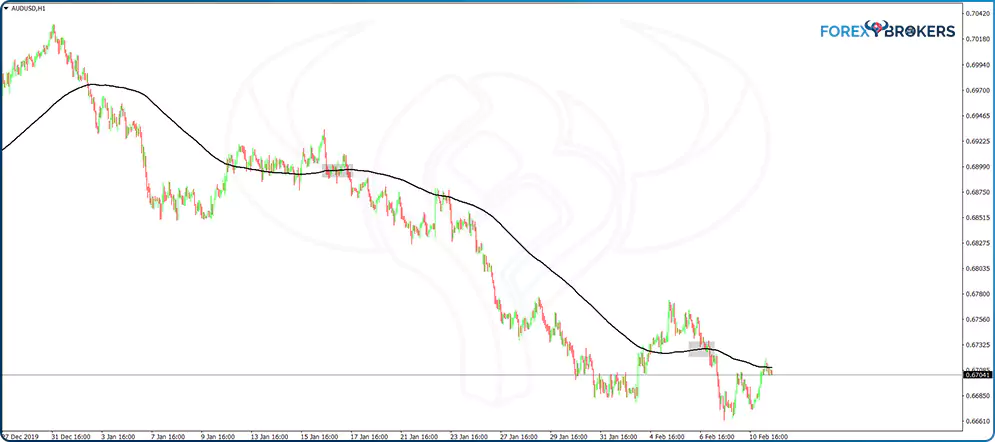
However, that’s not enough to consider a valid turnaround because at the moment the MA began rising, the price fell. As mentioned earlier, declining price coupled with rising MA represents a contradiction we should ignore.
What this chart tells us is that since the start of the 2020 trading year and until the middle of February (about six weeks), the AUDUSD moved in a strong bearish trend. Moreover, the MA(200) alone applied on the hourly timeframe was enough to spot the trend and ride it.
The 4h Timeframe
The 4h timeframe reveals an even more bearish picture. The first instance on the chart shows the MA(200) briefly declining, but the price at that time began correcting the bearish move.

However, the second time the MA(200) began a descending move, the market was below the MA and declining. When the two signals align, that’s the confirmation needed for a bearish trade.
As the chart shows, the market didn’t turn to the MA in the meantime. When it does, wait for the MA to turn before deciding to go long. On top of that, make sure the price is above the moving average and rising.
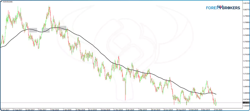
The MA(200) on the Daily Chart
The MA(200) on the daily timeframe reveals an even more bearish perspective – not only did the price sit at the lows, but the MA didn’t rise for more than eighteen months. The last bearish signal (the third grey square) confirms the price movement below the MA as a bearish move, and all traders needed to do was stay on the short side and to sell spikes into the MA until the MA began rising.
Weekly Timeframe
The weekly chart reveals an even uglier picture for AUDUSD bulls. Since 2012, the MA(200) hasn’t reversed. It has declined continuously for almost eight years with no signs of any change.
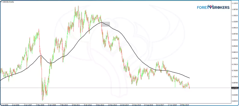
From a fundamental perspective, it reflects the interest rate differential between the two countries – Australia and the United States. While the Reserve Bank of Australia (RBA) kept slashing the rates with no hike, the United States Fed cut the rates earlier and even managed to hike them back to pre-crisis levels.
For those using the bigger timeframes to invest, rather than scalp or swing trade, the MA(200) provides a good benchmark against other trading strategies and economic releases. Until the MA(200) stops declining, the market will continue to push for lower lows.
Multiple Moving Averages on a Chart
So far, we’ve looked at a single moving average on a chart. Everything discussed up to this point is valid for all timeframes, all types of moving averages, all periods and all currency pairs or other financial instruments.
Other strategies exist that combine multiple moving averages on a chart to interpret the market’s direction. Below we look at two of the most popular trading strategies involving more than one single moving average – the golden or death cross and the perfect order setup.
Golden and Death Crosses
This setup involves two moving averages, one faster and one slower. It originates from the stock market because, as the name suggests, when a golden cross forms on a chart, it means the market has entered bullish territory. When a death cross appears on a chart, it spells trouble for bulls, signaling more downside to come.
The world’s major stock markets, in particular those in the United States, are leading indicators. Investors look at the stock market to get a clue as to where exactly the economy is in the business cycle. The conventional wisdom tells us that continued decline of the stock market points to future recessionary conditions or even worse – a depression.
Because the trading setup for golden or death crosses uses the daily timeframe, traders know that this is a big enough timeframe to have a meaningful impact on prices for the medium to long term. Therefore, often the business news channels mention when the S&P500 forms a golden or death cross as an indication that the stock market has entered bullish or bearish territory.
- Setup
The setup involves two moving averages – the MA(200) and the MA(50). Some traders use a different combination of periods for the two moving averages, but if we are to stick with the original setup, we should use the two averages mentioned above.
When the fast-moving average crosses above the slow one (i.e., MA(50) moves above MA(200)), the market forms a golden cross. This is a bullish sign and is viewed as a positive economic development, especially if it forms a major stock market index.
On the contrary, when the fast-moving average falls below the slow one, the market enters bearish territory. Investors in the stock market begin reducing exposure, and this triggers even more selling.
- How to Trade
Despite the fact that the setup for the golden and death cross is relatively simple, trading it requires plenty of attention to detail. Different trading strategies exist, and we’ll present a couple of them here.
Because of the implications of this setup for the stock market, and because the stock market heavily influences the price action on the currency market too, we’ll use the S&P500 daily chart to show how to trade this setup. Below is the daily chart with the two moving averages in place – the MA(200) and the MA(50) or the black and blue lines.

From left to right, when the blue line moved below the black one, the stock market formed a death cross — a bearish signal, indicating trouble for the United States economy. Investors typically borrow money in low-interest currencies and invest in the stock market in the search for higher yield. The move, called a risk-on move, triggers an advancing stock market.
But when a death cross appears on the chart, investors sell the stock to pay back the borrowed amount. The move triggers a higher JPY and a lower USD, and the easiest way to spot it is to look at the USDJPY reaction in relation to the S&P500 chart. This proves the case that what happens on the stock market has huge implications on the FX market too, especially when it comes to the United States stock market and the US dollar.
Coming back to the chart, by the time the death cross formed, it became obvious that remaining on the long side was riskier than sitting on the sidelines or going short. Selling the stock market is a bit difficult in the sense that investors need to borrow shares from the broker to sell short, and there’s no limit to the potential loss. But this is something familiar for the currency trader, emphasizing the need always to have a stop-loss order no matter the market to trade.
- Risk-Reward Ratios
After a cross appears on a chart, the next question is how to trade it. Risk-reward ratios help in this regard.
To set appropriate ones, aim for a reward that always exceeds the minimum twice the risk. This way, if things go wrong with the trade and the market turns against the desired outcome, using a risk-reward ratio bigger than 1:2 helps the trading account preserve capital for longer periods. We’ll touch on this sensitive subject later in this trading academy when we discuss some money management principles and rules.
To trade the death cross on the S&P500 chart, simply measure the distance from the moment the cross forms until the highest point in the previous market swing – that’s the risk. By multiplying it by two, you get the reward. As for the trading volume, it must be adapted considering the size of the trading account and how much the risk affects the bottom line. For instance, if the trader wants to risk 2% of the trading account on any single trade, then the distance from the entry point to the stop-loss should have a corresponding volume for the trade so that if the price reaches the stop-loss, the outcome doesn’t exceed the 2% target.
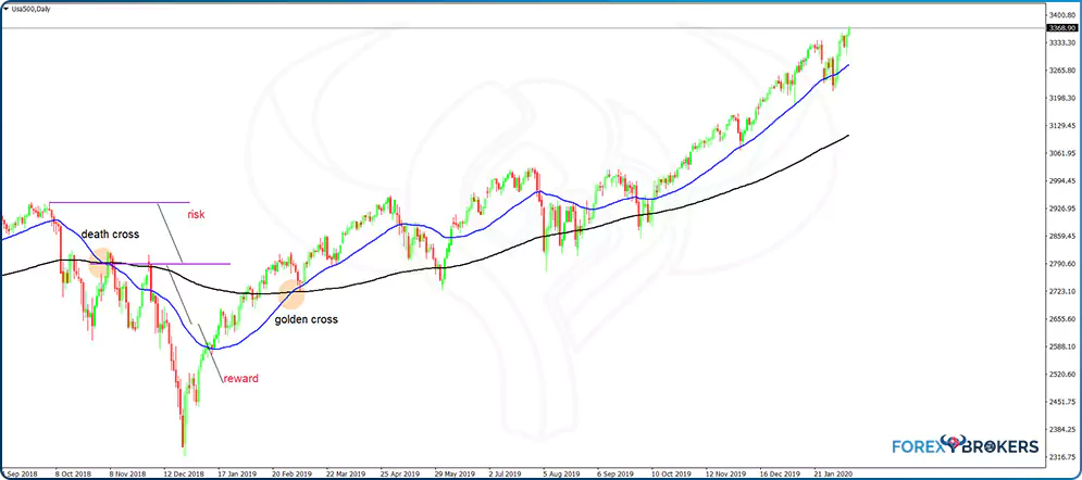
The same applies to the golden cross. When the MA(50) crosses above the MA(200), the S&P500 forms a golden cross – a bullish sign indicating a risk-on environment.
To trade it, follow the same rules as in the case of the death cross – go long by the time the golden cross is evident, place a stop-loss at the lowest point of the previous market swing, and a take-profit targeting twice the risk.
In this case, we see that the distance from the entry point to the stop-loss is much bigger than in the case of the death cross. Therefore, the volume for this trade should be substantially smaller than the volume of the death cross’s trade.
- Other Ways to Trade
So far, we’ve presented how to trade the golden and death crosses as instances that generate signals (i.e., trades). But golden and death crosses represent much more than just signals or entries in a trade. They offer a clue about a change in market dynamics, a change from bullish to bearish or bearish to bullish, which is something to consider moving forward.
Therefore, trading the actual signal or cross is one thing. However, the implications of the cross and the fact that the MA(200) offers strong resistance or support on the daily chart tells us that the golden and death crosses have a strong trending component too.
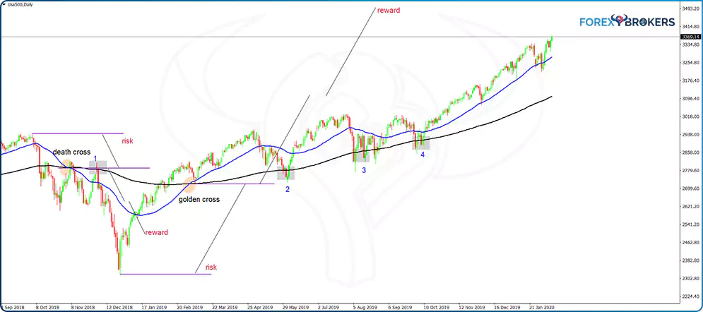
The grey areas on the chart above show how to sell resistance or buy support every time the price hits the MA(200) after the formation of a death or golden cross. In the first instance, the market forms a death cross, moves lower for a while, but then bounces back to the MA(200), giving a great entry to the short side. After all, the price just hit resistance.
Further on the right side of the chart, the price forms a golden cross. Following its formation, the market reverses and hits the MA(200), only to find strong support. It did that three consecutive times before moving higher in an accelerated bullish trend – each time offered a great opportunity to take additional trades.
- Risk and Reward
To set the parameters for this trade, we should consider the distance between the two moving averages at the time the price reaches the MA(200). Next, measure that distance and project it from the MA(200) in the opposite direction of the trade. For instance, if the setup is bullish, project the distance below the MA(200) to set the stop-loss order. Finally, project the same distance twice from the entry point in order to set the take-profit level and reach a 1:2 risk-reward ratio.
The following example refers to the second setup marked on the chart below. After measuring the distance between the two moving averages, the trader finds it easy to set the parameters for the long trade. As the chart shows, the take-profit level came fairly easily. The following two trades, the third and the fourth, also ended up in profit, with the price having no problem reaching the 1:2 risk-reward ratio.
The chart shows the powerful setups given by golden and death crosses and how performant a trading system becomes by following proper risk-reward ratios.
Conclusion
Moving averages are popular indicators in technical analysis. Mostly used in trend trading, they help traders follow the trend and align the trades with the main market direction.
Traders use different moving averages based on what their strategy focuses on. Some traders favor SMAs while others use moving averages that come closer to the recent price action.
In any case, moving averages’ biggest advantage is that they split the screen into bullish and bearish conditions, making it easier to spot the underlying trend, if any, and make the most of it. Also, when no trend is evident, moving averages suggest that the price action evolves in a range, so traders apply range-trading techniques to profit.
This article has presented just some of the types of MA in Forex. Nowadays, computers make it easy to compute complicated moving averages based on sophisticated mathematical formulas – fractal adaptive moving average, Hull moving average, or double exponential moving average, to name a few.
However, the strategies and principles presented in this article work with all types of moving averages. While some react better to trending conditions and others to quick market turns, the setups covered in this article are enough to enable any disciplined trader to profit from the market’s volatility.